Partial transcripts and images of the parish records for Tissington are on FamilySearch. I’ve gone through these, starting with the transcriptions and looked at every relevant image (plus a few) to make any corrections (not many) and add in the information not included in the transcripts (quite a lot) in a spreadsheet. I’ve also found census entries for anyone called Allsop who lived in or was born in Tissington and done the same thing plus added in a few bits and pieces from other sources.
Now the fun begins!
I used a plugin to load the spreadsheets into my Family Historian software giving me a file with lots of mini trees - and lots of duplicated people.
I started out by setting up the columns in the individual record view to be sorted by given name then estimated birth date (Family Historian has functions to calculate that) – and a columns relating to birth, baptism, marriage, census, death and burial. For the census I set the display up to show the place, if I had a census entry for the person, or a strike through if the census was before their earliest possible birth date, or after their last possible death date.
Clicking the image below should take you to a full size view.

Some duplicates were easy to spot, such as following a family group through the census. I merged any that appeared clear cut. I was left with a few more substantial trees, and quite a lot of stray small family groups and individuals. It was a good start, but time for a new approach if I wanted to get any further.
This is when I tried something with my software that I haven’t done before. I knew that there was an option to insert an additional tree into a chart, but I hadn’t ever made use of it as I had thought of it as mostly a presentation feature. It occured to me that I could use it as an analysis feature.
To get started I ran the standard “All Facts” query and sorted it by date. Starting with the earliest fact – the baptism of Richard Alsop, son of John and Jane Alsop on 15 May 1673 – I created an all-relatives chart. I then went down the list of facts and inserted an extra ‘tree’ for each fact not yet represented on the main chart.
Many of the ‘trees’ consisted of one or two names only. I could drag and drop the trees around, so I placed each ‘tree’ near to where I thought it might belong. I could also insert or draw shapes and text on the chart all from within Family Historian. Below is a marked up portion of the multiple tree chart. The coloured loops show the people from different ‘trees’ who I think may be the same person.

You can see that I had five separate records in the late 1660s and early 1700s containing a Robert Allsop.
- Baptism of Robert son of John and Jane in 1677
- Marriage to Mary Wragg 1703
- Birth of a son Thomas to Robert and Mary in 1704
- Burial of Mary, wife of Robert, in 1728 (no age given), and
- Burial of Robert in 1729 (no age or relationships given).
I also think that the Thomas who married Elizabeth Goodwin in the chart above may be the same person who married Martha, a few years later. The Thomas who married Martha is most likely my 6x great-grandfather, so I’m quite interested to know who his parents were.
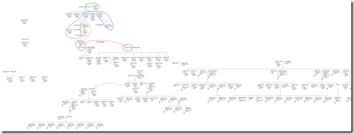
Blowe is a zoomed out view of the multiple tree chart. I counted 27 separate trees within the full version (which was very wide!), most of which I will be able to combine together now that I’ve seen how the pieces fit. A few individuals who I am not (yet?) able to fit in to the main family tree are sitting to the side.

For now I consider this little exercise to be an experiment and a learning experience. I’m very happy with how it’s working and I’m having a lot of fun. Sliding the different ‘trees’ into place really does feel like putting together a jigsaw puzzle.