Blog post

Showing posts with label analysis. Show all posts

Saturday, March 30, 2019

Examining my MyHeritage AutoClusters

Compared to other testing companies, MyHeritage has a lot of information about DNA matches displayed on the website. Unfortunately, the information I'm most interested in - the shared matches - is not available as a data download. 

Given the lack of access to the data I was curious to see what the new MyHeritage AutoCluster tool (based on the technology of Evert-Jan Blom from Genetic Affairs) could tell me. I went to the MyHeritage website, set the tool going, and after a time received the results in my email.

The AutoCluster tool applies a clustering algorithm to your DNA shared matches and provides the output as a list and a matrix chart visualisation. On opening the visualisation there is an 'oooh!' moment as all the blocks slide into place. When the process finished, my AutoCluster matrix looked like this:


The goal of this, or any other clustering tool on offer, is to identify groups of people that likely descended from a common ancestor. Those potential groups can be identified by their colour and placement on the chart.


A short guide to reading a matrix chart

  • Names of my matches are listed down the left-hand side and repeated along the top of the matrix (I've blurred them for privacy).
  • If there is a filled block at the intersection of two names (one at the side and one at the top) then those two people are a shared match.
  • Coloured blocks indicate clusters (as defined by the algorithm used).
  • Some people have connections to more than one cluster. Look to the grey blocks to see where those linkages are.
  • If there are a lot of grey blocks between two clusters, then those clusters are probably relevant to each other. For example, the first (red) and fourth (green) groups have several connections between several people.
Before I go on I should say that I have only reviewed my own AutoCluster results. Other user experiences may differ. MyHeritage has made efforts to accommodate all the vastly varying DNA networks of its users when it creates these matrix charts, without requiring users to adjust any settings. That's got to be difficult!

First impressions

The first thing I noticed was that the matrix was very fragmented. That could be representative of my data, but having browsed my DNA matches all those very small groups didn't feel quite right.

I liked the amount of information given for the thresholds used:
"Your AutoCluster analysis was generated using thresholds of 25 cM (minimum) and 350 cM (maximum). In addition, DNA Matches were required to share at least 15 cM with one another in order to be indicated with a colored or gray cell. A total number of 104 DNA Matches ended up in 26 clusters in the final analysis."

Matrix visualisations are limited in how many matches they can include in one view and still be readable. Filtering is necessary to limit the matches. The automatically selected thresholds seem reasonable.

I appreciated the list of 11 matches who had no shared matches at the thresholds used.

I was perturbed by the exclusion of 95 matches who both met the threshold and had shared matches:

"The following 95 matches met the inclusion criteria but ended up in singleton clusters without other members and are therefore excluded from the analysis as well."
95 matches in "singleton clusters"?! Why are there almost as many matches excluded for "singleton clusters" as there are matches actually included in the matrix? Just how aggressively does the algorithm chop up the groups?

As I read the long list of matches that had been excluded I was taken aback to see that my second closest match, at 129 cM shared, was among the "singleton clusters".

Digging deeper: A new view

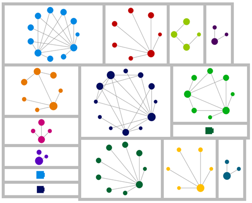
If you've been following my blog, you'll know that network graphs are my favoured tool for understanding shared match relationships. Using the csv file provided with the output, I was able to wrangle the data into shape and create a network graph version of the AutoCluster matrix information.

I've aligned the group labels and colours with the matrix display (but made the second and third use of each colour darker for clarity). The numbers indicate the group in the AutoCluster result reading down the diagonal. The dot sizes reflect the amount of DNA I share with each person. Each line is a shared match relationship (the lines here are equivalent to the blocks in the matrix chart).

This was the result.


Looking at this graph, I retain my first impression that the algorithm is heavy-handed in breaking up the groups. For example, groups 1, 4 and two elements of thirteen look like they should be together, as do 24-25, and 3-19-22.

I'm relaxed about which group the closer match in group 11 is allocated to. That person would naturally "belong" in more than one cluster as they would likely match with groups of people with more distant ancestors from each side of our shared branch.

With this view, I also see that there are a few 'strings' of small groups. They include matches for whom, without more information, inclusion in one group or the next would be equally valid. That can't be helped when working with shared match information alone but is a reason to take care when looking at small groups in a matrix layout and track back to any other connected groups.

There is huge potential for refinement of matching groups with the data MyHeritage has - and that I'd like to get hold of as downloads! Information about the total size of the match between pairs, and whether the matches have a triangulated segment could be very informative to group allocations.

How would this have looked if the other 95 matches were included? I suspect that the sensible breakup of some of the smaller groups would be clearer for a start.

Digging even deeper - segment data

Looking at the network version I created, my impression is that groups 1, 4, two people from 13 and my closest match in group 11 are connected densely enough that they should really be a single group. 


One of the website tools that I like on my MyHeritage is the chromosome browser tool. I entered the names of matches in my proposed larger group into the tool in batches. I both started and ended with my closest match. The result was clear. All of the matches I identified had triangulated segments with me and each other on chromosome three. (I couldn't find one match from group 4 in my match list to make that comparison). 

I also checked the other members of groups 13 and 11 (outside the circle above). None of them had a shared segment with me at that location.


As an aside, some of the pairs don't show as matched in the matrix or network graph (based on the matrix data) even though they clearly triangulate on a reasonably sized segment. This is because some of the pairs match at just below the total matching threshold that was used to filter the graph. This is a point to be aware of when interpreting any shared match information, or indeed any DNA information where some sort of threshold or cutoff has been used.


Conclusions

I have only reviewed my own results and they may not be typical of most users. There seems to be an overly aggressive breakup of groups. This has made the chart fragmented and harder to read and interpret than it otherwise would be. 

The excessive fragmentation of groups is also likely the reason that almost half of my relevant matches were assigned to "singleton clusters" and excluded. Some of my best and most useful matches have been excluded. I'm concerned that the baby has been thrown out with the bathwater here.

When using AutoClusters I would suggest that users should:

  • Read the notes. Take note of who's in and out.
  • Use the grey cells to check for connections between groups.
  • Don't assume that the matrix will include your best and closest matches. They could be excluded!
Remember also that the result reflects only a small proportion of your matches (less than 2% in my case). There is no doubt much more to be found in matching results. I've written to MyHeritage in the past and asked that they consider allowing downloads of shared match lists (including shared match cM amounts). This would allow for analysis and clustering of more matches and for different clustering techniques to be used for those who want to do their own analysis.

Overall though my feeling about the AutoCluster tool is that something is better than nothing. The AutoCluster tool is a helpful way to start identifying groups at the top end of your match list, but caution is needed.  

Saturday, March 3, 2018

Triangulation is the icing, not the cake

I’m seeing more and more DNA network graphing activity going on. I’m so pleased to see that there are tools being developed to make this type of approach widely available.

One concern I have with these new developments is the exclusive use of “triangulated” segments to link between two DNA matches. By triangulated segments I mean segments of DNA that you and two of your DNA matches all have in common.

Don't get me wrong - triangulation is a very good thing. If you have a triangulated DNA segment, there’s a very good chance that all three of you inherited it from the same ancestor (whoever that may be). Sticking to triangulated segments only is appealing and seems an intuitively sensible choice – they provide a degree of confidence because you know that the relationships you see are relevant to your ancestry.

My contention is that the addition of DNA relationships that don’t have triangulated segments is essential to find groups of mid range – say 2nd to 4th - cousins descended from a common ancestor among a set of matches.

The triangulated view

Below is a layout of triangulated segments extracted from Gedmatch using the Tier 1 triangulation report (chart produced with Gephi). Many of the groups here – particularly the large groups – are very distant relatives.

Notice the four pink dots? They are known cousins who all share a common ancestor. They match me and each other in the 1st cousin once removed to fourth cousin range. Only one of the six possible pairings of the four shows a triangulated segment! And that line is between the two more distant (to me) matches. If I didn’t know that all four of them had a common ancestor there would not be much in the chart that compelled me to pursue how those four people match.

Chart showing distinct separated clusters of dots and lines

The untriangulated view

Below is a different view of the data, taking a different approach.

Here I added in shared match information from Gedmatch’s “People who match one or both of two kits” report for all my matches over 20 centiMorgans (cM) . This includes pairs of matches without any triangulated (with me) segments. In the chart I have limited the matches shown those who share 20cM with me AND with each other. This is similar to but slightly more inclusive than Ancestry’s thresholds (there’s another post in what Ancestry does that I may write one day).

  • The blue lines indicate the match pair has at least one shared segment in common with me.
  • Grey lines indicate that the people at each end of the line match each other, but there is no overlap of segments between the pair of matches and me.

I needed to limit the connections between people on the amount of DNA they shared with each other in order to stop the number of links in the chart from becoming ridiculous – and I have no known endogamy.

I should also mention that in both these charts, thicker lines indicate larger shared cM amounts between the pairs of matches. The thickest lines are parent/child or sibling relationships. The size of the dot reflects the relationship with me. Larger dots are closer relatives.

Chart with sparse but interconnected dots and lines, with a few distinct clusters

Quite a different picture. While I’ve lost a lot of distant matches, there is now the suggestion of a grouping with my known cousins. The chart is more interlinked – some of these links may be coincidental relationships nothing to do with my tree.  I would look upon single links between clusters with suspicion but not dismiss them entirely.

There are some some clusters entirely made up of “untriangulated” match pairs including relatives closer than 20cM to me who do NOT show up in the triangulated only version above. These are clusters that are close enough that I might be able to determine the common ancestor with a little digging. 

Is what I am seeing with my four cousins a one-in-a-million random chance occurrence?Chromosome browser view with blue and orange segment markers that don't overlap

I don’t think so. I suspect that there’s a higher chance of relatives in a researchable timeframe not sharing a triangulated segment than one may imagine.

Here’s another example – a Family Tree DNA chromosome browser view of two people who share one great-great grandparent with me. They are more closely related to each other. There is ample paper and other DNA evidence to say that the relationship is correct.

No stacked blue and orange lines = no triangulated segments.

Once again, if I didn’t already know about it, a connection between these two people is exactly what I would want to find in my data.

I would be interested to know if readers can find further examples of close matches that don’t triangulate in their data.

So if triangulated matches between closer relatives are so hard to come by, why those big clusters of distant triangulated relationships?

As each generation passes, you are less likely to inherit DNA from a particular ancestor. For a very distant ancestor you may have only one segment, if any. Each ancestor, however, has on average an increasing number of descendants with each generation. The chances of another descendant having the same inherited segment as you are slim… but there are a lot of other descendants. A small fraction of them do inherit that same segment. If they DNA test, they all match in common with each other on that one segment and become a cluster in the chart. You can see it when you look at the chromosome data for the matches in a big cluster – they all match in a big stack at one location.

Keeping only triangulated segments is cleaner and increases the chance that the relationship you see is due to a shared ancestor – but that doesn’t necessarily make them more helpful for research. There is a risk of losing close match information that could be researched, for the sake of distant match information beyond paper trail timeframes.

Finding the balance

A compromise position that trimmed off untriangulated relationships for distant relatives, but kept them where there was a close relationship, might be the answer.

The version of the graph below uses the same thresholds as the untriangulated chart (20cM shared with me, 20cM shared between match pairs), but then adds in all triangulated segments between pairs of people who each share 20 cM or more with me. This adds in a few more matches, and the addition of the less close triangulated lines support some of the untriangulated clusters. I now have a good picture of that group of four known matches in pink. There is a winding path of untriangulated matches connecting several of the triangulated (and untriangulated) groups. While they complicate the picture they do alert me to the possibility that my tree may have intermarriage that I’m not aware of. It’s messy, but not necessarily a bad thing.

Network chart showing interconnected lines, with a moderate number of distinct clusters

DNA products and datasets

I would like to see DNA matching datasets (or products made from them) with as many as possible of the following attributes:

  • Inclusion of close in-common-with relationships that don’t have triangulated segments.
  • Data on the strength of the total connection between pairs of matches (ie or edge filters using this information).
  • Ability to distinguish between match pairs with and without triangulated segments.
  • Ability to set different thresholds for triangulated and non-triangulated edges.
  • Inclusion of total match size for each match.

Triangulated segments are the icing, not the cake.

I hope that as more products and data extraction capabilities are developed some of these ideas will be incorporated. You can help by giving developers a push along these lines when you provide feedback about their products.


Monday, September 5, 2016

Visualising DNA matches–FTDNA data

I decided to see what I could learn from my Family Tree DNA (FTDNA) match data when I looked at it using the visualisation tool, NodeXL. For my earlier discussion of this tool, see my post where I investigate Ancestry DNA data with it.

I match with around 960 individuals in FTDNA. There are around 10,000 ‘in common with’ matches between those people. Lets see how 10,000 connections between 960 people looks….

NodeXL01_AllPeople

Like a colony of spiders, perhaps?

Each dot represents a person, each line represent a DNA connection between two individuals. There are two bunched up areas of dots where my matches have a lot of interconnections, but otherwise there is little structure to be seen. I tried using all the different layout algorithms available, but this is as good as it gets on the first pass.

Since my father has tested I can divide my DNA matches into two groups based on whether they also match him. I have called the two groups “Paternal” and “Maternal” – which possibly is not entirely accurate but will be close enough for my purposes here – and redrawn the chart with each group laid out separately.

NodeXL02_MaternalPaternal

There are clearly a lot of interconnection between my maternal and paternal matches. I’m surprised by the number of the interconnections, as I don’t descend from an endogamous population.

There are two critical facts about the ‘in common with’ relationships that are not shown in the chart:

  • how close the relationship between my DNA matches is, and more importantly
  • whether their relationships are anything to do with my family tree.

It may be possible to incorporate the second point using FTDNA data. It should be possible to incorporate both points using GEDMatch. I hope to attempt this in a future post.

This exercise suggests to me that it would be even more dangerous than I thought to rely on on ‘in common with’ data without also inspecting segment data.

Friday, June 17, 2016

Exploring my DIY Ancestry DNA circles

In my last post I created DIY Ancestry DNA circles. When I looked at the circles, one of them was of immediate interest to me as there were two names I recognised. I’ve coloured those people in green:

image

The green dots represent a pair of known-to-each-other cousins that I have been in correspondence with. Their common ancestor shares a family name also found in my tree. Given our predicted relationship, it’s likely that our common ancestor is just one or two generations beyond the outermost branches of our known trees. It feels so close we could almost touch it! Yet, we haven’t found that extra bit of evidence that will help us locate the common link.

When I planned this post I was going to say that I noticed something useful when I changed the labels (not displayed here for privacy) to the person who administered the account. Which I did. But since then, I have found another feature available in the free version of NodeXL that made me very happy – a function that will create new “edges” between people based on information in whatever column you choose.

The function can be found under the heading “Graph Metrics”:

image

That was exactly what I wanted to do, and it was very quick and easy. A few clicks, the spreadsheet had a bit of a think, and it was done.

This is what it looks now that I’ve added additional relationships between people whose DNA accounts are administered by the same person. I’ve set the new edges to red:

image

There’s a group of three people who match myself and one or both of the ‘green dots’ and whose accounts are administered by the same person (so are probably known relatives to each other).

I contacted the administrator for those accounts, explained what I had found, and asked if the three individuals had a common ancestor. She replied and gave me the name of an individual born in the early 1800s.

I would love to say that the connection between us all was immediately apparent, or that we now know where in Scotland or Ireland we should look, or even that I have further evidence that the surname of the ‘green dots’ common ancestor is the right one. Unfortunately that’s not the case… yet. It could have been though, and that’s why this sort of exercise is worth doing.

I haven’t tried to contact the other three individuals in this circle. That’s next on my list – if I can hold myself back from trying out all the other things I can think of to do with this tool!

Tuesday, June 14, 2016

DIY Ancestry DNA circles

Ancestry didn’t give me any DNA circles, so I made my own. If you want to join me in the DNA circle loop, then you will need AncestryDNA results and:

Use the DNAGedcom client to download your Ancestry matches and in-common-with (ICW) results as spreadsheets. You will need to click “Gather Matches” and “Gather ICW”. It’s the most convenient way to get the shared match information from Ancestry.

NodeXL is where the magic happens. It’s an Excel tool for social network analysis. I used NodeXL because it’s in Excel which I’m familiar with and it has all the facilities I need in the free version. I don’t know anything about social network analysis, and I didn’t need to in order to get the result I wanted. Follow the instructions on the website linked above to get started. It takes a little fiddling to get used to it, but in the familiar Excel interface it’s not as intimidating as it might at first seem.

Now the fun begins!

When you create a file using the template, you will see an extra ribbon, and an area for your charts to display. Those extra features won’t be there when you open Excel as normal, only when you open a spreadsheet from the template.

You will see several tabs. The most important for our purposes are “Vertices” and “Edges”. Think of “Vertices” as people, and “Edges” as relationships between people. The list of Match IDs goes into “vertices”, and the paired Match IDs in the ICW file goes into “edges”. As it’s Excel, you can cut and paste data into the sheets. I pasted twice on each sheet – the first time with just the match ID numbers in the first column (or two columns for Edges), then the rest of the columns into the “add your own columns here” section.

Click “Refresh Graph” to see a graph of your information. When you first drop match information in you will probably get a big mess of dots and crossing lines. There are options to fix that.

With a bit of fiddling, I came up with this:

image 

Look! I’ve got circles!

Each dot represents a person, each line a DNA relationship between two people. When trying to interpret the information remember that that Ancestry has a cut off – it won’t show shared matches unless at least one of the people is a fourth cousin or closer to you. At least, that’s how I think it works. I’m not sure if they also have to be fourth cousins or closer to each other to show up. If you can enlighten me on exactly how it works, I’d be grateful.

The point is to remember that because of the cut-off there are likely to be other relationships between the dots that you can’t see. I assume that’s what’s happening with the fan shaped ‘circles’. I had 35 fourth cousins or closer at the time of making this chart and no circles or “New Ancestor Discoveries”.

To get distinct clusters I first used the “Group by cluster…” option on the toolbar.

image

The groups might still be mixed up at this stage. To separate the groups from each other, I clicked the little arrow dropdown to the right of “Circle” (above) and under “Layout options” I chose “Lay out each of the graph’s groups in it’s own box”.

image

For the layout I chose “Circle”. Because I wanted DNA circles. You could make a DNA spiral or a sine wave or a grid or a random layout or … but circles work nicely and they help with the circle-envy. This option is available both on the main NodeXL ribbon, and in the settings at the top of the graph area.

“Autofill columns” on the main ribbon lets you easily move information from your own columns into the columns that control the graph’s appearance. There are a lot of options to play with – size and colour of dots, thickness of lines all have potential. I set the size of each dot to the number of Shared cM with me. You can also label the dots using information on the sheet. The obvious label to use is the person’s name.

You need to refresh the graph by clicking “Show graph” when data changes on a worksheet. If you’re only changing display options, you can save the recalculation time by clicking “Lay Out Again”.

There’s a lot of fun to be had just playing with the options. I’ve also tried this with my FTDNA results. For those, I had a much busier chart. Different clustering algorithms had different effects, and the dynamic filter came in useful to clear away matches who sat in distracting “pile up regions” which could be seen as a dense collection of interlinked spots.

In my next post I’ll show you how I used my DIY Ancestry DNA circles to identify a new research lead.

Tuesday, March 29, 2016

A colour coded longevity chart

As I said in my recent Facebook post, I love a good colour coded chart!

Colour coded birthplaces charts have been doing the rounds, sparked off by J Paul Hawthorne. I confess I didn’t see his original post – I understand the trees doing the rounds are mostly based on an Excel template he provided. He certainly added a lot of colour to my recent genealogy reading!

I have been using various sorts of visual cues in my charts for a very long time. I’ll say it again – I love a good colour coded chart! The ability to add visual cues to charts is one of my must-have genealogy software features. Family Historian has exceptional capabilities in this respect but, and it’s a big but, you need to be comfortable with functions and formulas to get the most from it. Fortunately, I eat functions and formulas for breakfast.

On this occasion I was further inspired by Pauleen Cass, who took the colour coded chart in a different direction and added Health Inheritance information to her chart.

I’ve created a longevity diagram scheme with a different colour for each decade of life attained, 90+ being the top age bracket. I picked a colour-blind safe set of colours from the Colorbrewer website with a deep red/orange for childhood deaths through to a deep blue for those aged 90+. I’ve used grey for living/no age at death information.

I would really like to have fewer yellow boxes and more deep blue boxes on my tree! The two orange boxes aren’t so much of a concern for my own personal wellbeing – I survived having my children and I’m not likely to be lost at sea.

image

The nice thing about having a diagram scheme set up within your genealogy software is that you can then use it to look at other parts of your tree with no fuss.

My ancestors Robert Mack and Jane Mercer lost too many young children. Looking at the three grey boxes below – Eliza would have been no more than 15 and the second Robert no more than 10. I have information that Alexander at least lived to early adulthood, but I don’t know what became of him after that. My ancestor Catherine with the palest of blue boxes looks suddenly quite robust compared to the rest of her family.

image

Although Family Historian diagram schemes involve some setting up, they can be easily shared among users. Download the scheme, double click to install. Easy.

I’m thinking of giving this diagram scheme a few more tweaks – perhaps to use age at death estimates so more of those I-know-they-must-be-red boxes will show as such, and contributing it to the Family Historian User Group website.

Saturday, January 23, 2016

Rearranging a genealogy jigsaw

I’ve been having a lot of fun fitting together the puzzle pieces of the Allsop family of Tissington, Derbyshire, England. In doing so, I’ve learnt more about the capabilities of my genealogy software package, Family Historian.

Partial transcripts and images of the parish records for Tissington are on FamilySearch. I’ve gone through these, starting with the transcriptions and looked at every relevant image (plus a few) to make any corrections (not many) and add in the information not included in the transcripts (quite a lot) in a spreadsheet. I’ve also found census entries for anyone called Allsop who lived in or was born in Tissington and done the same thing plus added in a few bits and pieces from other sources.

Now the fun begins!

I used a plugin to load the spreadsheets into my Family Historian software giving me a file with lots of mini trees - and lots of duplicated people.

I started out by setting up the columns in the individual record view to be sorted by given name then estimated birth date (Family Historian has functions to calculate that) – and a columns relating to birth, baptism, marriage, census, death and burial. For the census I set the display up to show the place, if I had a census entry for the person, or a strike through if the census was before their earliest possible birth date, or after their last possible death date.

Clicking the image below should take you to a full size view.

image

Some duplicates were easy to spot, such as following a family group through the census. I merged any that appeared clear cut. I was left with a few more substantial trees, and quite a lot of stray small family groups and individuals. It was a good start, but time for a new approach if I wanted to get any further.

This is when I tried something with my software that I haven’t done before. I knew that there was an option to insert an additional tree into a chart, but I hadn’t ever made use of it as I had thought of it as mostly a presentation feature. It occured to me that I could use it as an analysis feature.

To get started I ran the standard “All Facts” query and sorted it by date. Starting with the earliest fact – the baptism of Richard Alsop, son of John and Jane Alsop on 15 May 1673 – I created an all-relatives chart. I then went down the list of facts and inserted an extra ‘tree’ for each fact not yet represented on the main chart.

Many of the ‘trees’ consisted of one or two names only. I could drag and drop the trees around, so I placed each ‘tree’ near to where I thought it might belong. I could also insert or draw shapes and text on the chart all from within Family Historian. Below is a marked up portion of the multiple tree chart. The coloured loops show the people from different ‘trees’ who I think may be the same person.

image

You can see that I had five separate records in the late 1660s and early 1700s containing a Robert Allsop.
  • Baptism of Robert son of John and Jane in 1677
  • Marriage to Mary Wragg 1703
  • Birth of a son Thomas to Robert and Mary in 1704
  • Burial of Mary, wife of Robert, in 1728 (no age given), and
  • Burial of Robert in 1729 (no age or relationships given).
It didn’t seem so obvious when I was looking at a long list of names and dates as it does, to me, on the chart.

I also think that the Thomas who married Elizabeth Goodwin in the chart above may be the same person who married Martha, a few years later. The Thomas who married Martha is most likely my 6x great-grandfather, so I’m quite interested to know who his parents were.

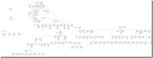
Blowe is a zoomed out view of the multiple tree chart. I counted 27 separate trees within the full version (which was very wide!), most of which I will be able to combine together now that I’ve seen how the pieces fit. A few individuals who I am not (yet?) able to fit in to the main family tree are sitting to the side.

image

For now I consider this little exercise to be an experiment and a learning experience. I’m very happy with how it’s working and I’m having a lot of fun. Sliding the different ‘trees’ into place really does feel like putting together a jigsaw puzzle.