Blog post

Friday, June 17, 2016

Exploring my DIY Ancestry DNA circles

In my last post I created DIY Ancestry DNA circles. When I looked at the circles, one of them was of immediate interest to me as there were two names I recognised. I’ve coloured those people in green:

image

The green dots represent a pair of known-to-each-other cousins that I have been in correspondence with. Their common ancestor shares a family name also found in my tree. Given our predicted relationship, it’s likely that our common ancestor is just one or two generations beyond the outermost branches of our known trees. It feels so close we could almost touch it! Yet, we haven’t found that extra bit of evidence that will help us locate the common link.

When I planned this post I was going to say that I noticed something useful when I changed the labels (not displayed here for privacy) to the person who administered the account. Which I did. But since then, I have found another feature available in the free version of NodeXL that made me very happy – a function that will create new “edges” between people based on information in whatever column you choose.

The function can be found under the heading “Graph Metrics”:

image

That was exactly what I wanted to do, and it was very quick and easy. A few clicks, the spreadsheet had a bit of a think, and it was done.

This is what it looks now that I’ve added additional relationships between people whose DNA accounts are administered by the same person. I’ve set the new edges to red:

image

There’s a group of three people who match myself and one or both of the ‘green dots’ and whose accounts are administered by the same person (so are probably known relatives to each other).

I contacted the administrator for those accounts, explained what I had found, and asked if the three individuals had a common ancestor. She replied and gave me the name of an individual born in the early 1800s.

I would love to say that the connection between us all was immediately apparent, or that we now know where in Scotland or Ireland we should look, or even that I have further evidence that the surname of the ‘green dots’ common ancestor is the right one. Unfortunately that’s not the case… yet. It could have been though, and that’s why this sort of exercise is worth doing.

I haven’t tried to contact the other three individuals in this circle. That’s next on my list – if I can hold myself back from trying out all the other things I can think of to do with this tool!

Tuesday, June 14, 2016

DIY Ancestry DNA circles

Ancestry didn’t give me any DNA circles, so I made my own. If you want to join me in the DNA circle loop, then you will need AncestryDNA results and:

Use the DNAGedcom client to download your Ancestry matches and in-common-with (ICW) results as spreadsheets. You will need to click “Gather Matches” and “Gather ICW”. It’s the most convenient way to get the shared match information from Ancestry.

NodeXL is where the magic happens. It’s an Excel tool for social network analysis. I used NodeXL because it’s in Excel which I’m familiar with and it has all the facilities I need in the free version. I don’t know anything about social network analysis, and I didn’t need to in order to get the result I wanted. Follow the instructions on the website linked above to get started. It takes a little fiddling to get used to it, but in the familiar Excel interface it’s not as intimidating as it might at first seem.

Now the fun begins!

When you create a file using the template, you will see an extra ribbon, and an area for your charts to display. Those extra features won’t be there when you open Excel as normal, only when you open a spreadsheet from the template.

You will see several tabs. The most important for our purposes are “Vertices” and “Edges”. Think of “Vertices” as people, and “Edges” as relationships between people. The list of Match IDs goes into “vertices”, and the paired Match IDs in the ICW file goes into “edges”. As it’s Excel, you can cut and paste data into the sheets. I pasted twice on each sheet – the first time with just the match ID numbers in the first column (or two columns for Edges), then the rest of the columns into the “add your own columns here” section.

Click “Refresh Graph” to see a graph of your information. When you first drop match information in you will probably get a big mess of dots and crossing lines. There are options to fix that.

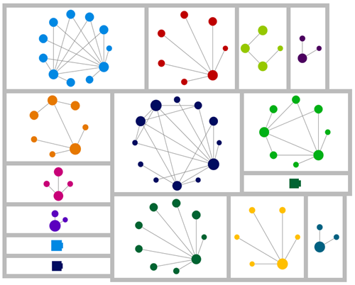
With a bit of fiddling, I came up with this:

image 

Look! I’ve got circles!

Each dot represents a person, each line a DNA relationship between two people. When trying to interpret the information remember that that Ancestry has a cut off – it won’t show shared matches unless at least one of the people is a fourth cousin or closer to you. At least, that’s how I think it works. I’m not sure if they also have to be fourth cousins or closer to each other to show up. If you can enlighten me on exactly how it works, I’d be grateful.

The point is to remember that because of the cut-off there are likely to be other relationships between the dots that you can’t see. I assume that’s what’s happening with the fan shaped ‘circles’. I had 35 fourth cousins or closer at the time of making this chart and no circles or “New Ancestor Discoveries”.

To get distinct clusters I first used the “Group by cluster…” option on the toolbar.

image

The groups might still be mixed up at this stage. To separate the groups from each other, I clicked the little arrow dropdown to the right of “Circle” (above) and under “Layout options” I chose “Lay out each of the graph’s groups in it’s own box”.

image

For the layout I chose “Circle”. Because I wanted DNA circles. You could make a DNA spiral or a sine wave or a grid or a random layout or … but circles work nicely and they help with the circle-envy. This option is available both on the main NodeXL ribbon, and in the settings at the top of the graph area.

“Autofill columns” on the main ribbon lets you easily move information from your own columns into the columns that control the graph’s appearance. There are a lot of options to play with – size and colour of dots, thickness of lines all have potential. I set the size of each dot to the number of Shared cM with me. You can also label the dots using information on the sheet. The obvious label to use is the person’s name.

You need to refresh the graph by clicking “Show graph” when data changes on a worksheet. If you’re only changing display options, you can save the recalculation time by clicking “Lay Out Again”.

There’s a lot of fun to be had just playing with the options. I’ve also tried this with my FTDNA results. For those, I had a much busier chart. Different clustering algorithms had different effects, and the dynamic filter came in useful to clear away matches who sat in distracting “pile up regions” which could be seen as a dense collection of interlinked spots.

In my next post I’ll show you how I used my DIY Ancestry DNA circles to identify a new research lead.