Blog post

Showing posts with label DNA. Show all posts

Saturday, March 30, 2019

Examining my MyHeritage AutoClusters

Compared to other testing companies, MyHeritage has a lot of information about DNA matches displayed on the website. Unfortunately, the information I'm most interested in - the shared matches - is not available as a data download. 

Given the lack of access to the data I was curious to see what the new MyHeritage AutoCluster tool (based on the technology of Evert-Jan Blom from Genetic Affairs) could tell me. I went to the MyHeritage website, set the tool going, and after a time received the results in my email.

The AutoCluster tool applies a clustering algorithm to your DNA shared matches and provides the output as a list and a matrix chart visualisation. On opening the visualisation there is an 'oooh!' moment as all the blocks slide into place. When the process finished, my AutoCluster matrix looked like this:


The goal of this, or any other clustering tool on offer, is to identify groups of people that likely descended from a common ancestor. Those potential groups can be identified by their colour and placement on the chart.


A short guide to reading a matrix chart

  • Names of my matches are listed down the left-hand side and repeated along the top of the matrix (I've blurred them for privacy).
  • If there is a filled block at the intersection of two names (one at the side and one at the top) then those two people are a shared match.
  • Coloured blocks indicate clusters (as defined by the algorithm used).
  • Some people have connections to more than one cluster. Look to the grey blocks to see where those linkages are.
  • If there are a lot of grey blocks between two clusters, then those clusters are probably relevant to each other. For example, the first (red) and fourth (green) groups have several connections between several people.
Before I go on I should say that I have only reviewed my own AutoCluster results. Other user experiences may differ. MyHeritage has made efforts to accommodate all the vastly varying DNA networks of its users when it creates these matrix charts, without requiring users to adjust any settings. That's got to be difficult!

First impressions

The first thing I noticed was that the matrix was very fragmented. That could be representative of my data, but having browsed my DNA matches all those very small groups didn't feel quite right.

I liked the amount of information given for the thresholds used:
"Your AutoCluster analysis was generated using thresholds of 25 cM (minimum) and 350 cM (maximum). In addition, DNA Matches were required to share at least 15 cM with one another in order to be indicated with a colored or gray cell. A total number of 104 DNA Matches ended up in 26 clusters in the final analysis."

Matrix visualisations are limited in how many matches they can include in one view and still be readable. Filtering is necessary to limit the matches. The automatically selected thresholds seem reasonable.

I appreciated the list of 11 matches who had no shared matches at the thresholds used.

I was perturbed by the exclusion of 95 matches who both met the threshold and had shared matches:

"The following 95 matches met the inclusion criteria but ended up in singleton clusters without other members and are therefore excluded from the analysis as well."
95 matches in "singleton clusters"?! Why are there almost as many matches excluded for "singleton clusters" as there are matches actually included in the matrix? Just how aggressively does the algorithm chop up the groups?

As I read the long list of matches that had been excluded I was taken aback to see that my second closest match, at 129 cM shared, was among the "singleton clusters".

Digging deeper: A new view

If you've been following my blog, you'll know that network graphs are my favoured tool for understanding shared match relationships. Using the csv file provided with the output, I was able to wrangle the data into shape and create a network graph version of the AutoCluster matrix information.

I've aligned the group labels and colours with the matrix display (but made the second and third use of each colour darker for clarity). The numbers indicate the group in the AutoCluster result reading down the diagonal. The dot sizes reflect the amount of DNA I share with each person. Each line is a shared match relationship (the lines here are equivalent to the blocks in the matrix chart).

This was the result.


Looking at this graph, I retain my first impression that the algorithm is heavy-handed in breaking up the groups. For example, groups 1, 4 and two elements of thirteen look like they should be together, as do 24-25, and 3-19-22.

I'm relaxed about which group the closer match in group 11 is allocated to. That person would naturally "belong" in more than one cluster as they would likely match with groups of people with more distant ancestors from each side of our shared branch.

With this view, I also see that there are a few 'strings' of small groups. They include matches for whom, without more information, inclusion in one group or the next would be equally valid. That can't be helped when working with shared match information alone but is a reason to take care when looking at small groups in a matrix layout and track back to any other connected groups.

There is huge potential for refinement of matching groups with the data MyHeritage has - and that I'd like to get hold of as downloads! Information about the total size of the match between pairs, and whether the matches have a triangulated segment could be very informative to group allocations.

How would this have looked if the other 95 matches were included? I suspect that the sensible breakup of some of the smaller groups would be clearer for a start.

Digging even deeper - segment data

Looking at the network version I created, my impression is that groups 1, 4, two people from 13 and my closest match in group 11 are connected densely enough that they should really be a single group. 


One of the website tools that I like on my MyHeritage is the chromosome browser tool. I entered the names of matches in my proposed larger group into the tool in batches. I both started and ended with my closest match. The result was clear. All of the matches I identified had triangulated segments with me and each other on chromosome three. (I couldn't find one match from group 4 in my match list to make that comparison). 

I also checked the other members of groups 13 and 11 (outside the circle above). None of them had a shared segment with me at that location.


As an aside, some of the pairs don't show as matched in the matrix or network graph (based on the matrix data) even though they clearly triangulate on a reasonably sized segment. This is because some of the pairs match at just below the total matching threshold that was used to filter the graph. This is a point to be aware of when interpreting any shared match information, or indeed any DNA information where some sort of threshold or cutoff has been used.


Conclusions

I have only reviewed my own results and they may not be typical of most users. There seems to be an overly aggressive breakup of groups. This has made the chart fragmented and harder to read and interpret than it otherwise would be. 

The excessive fragmentation of groups is also likely the reason that almost half of my relevant matches were assigned to "singleton clusters" and excluded. Some of my best and most useful matches have been excluded. I'm concerned that the baby has been thrown out with the bathwater here.

When using AutoClusters I would suggest that users should:

  • Read the notes. Take note of who's in and out.
  • Use the grey cells to check for connections between groups.
  • Don't assume that the matrix will include your best and closest matches. They could be excluded!
Remember also that the result reflects only a small proportion of your matches (less than 2% in my case). There is no doubt much more to be found in matching results. I've written to MyHeritage in the past and asked that they consider allowing downloads of shared match lists (including shared match cM amounts). This would allow for analysis and clustering of more matches and for different clustering techniques to be used for those who want to do their own analysis.

Overall though my feeling about the AutoCluster tool is that something is better than nothing. The AutoCluster tool is a helpful way to start identifying groups at the top end of your match list, but caution is needed.  

Friday, June 29, 2018

AncestryDNA Shared Match Quiz: Results

Have you tried the AncestryDNA Shared Match Quiz? If not, give it a go. The results will still be here when you come back.

If it made your head spin, don’t despair. You were not alone.

Total score

As at this morning, there were 812 valid responses to the quiz. Of these, 465 scored less than 5/10. Only 13 responses scored full marks. It appears I’m a tough quizmaster.

image

Results by question

Questions 1 to 5 considered shared matches with an estimated 4th or closer cousin. The questions were:

Betty is your estimated "3rd to 4th" cousin and shares 153cM with you. When you view her match page, you see three shared matches.

1. How many matches do you and Betty share in total? That is, how many people who appear anywhere in your full match list also appear anywhere in Betty's full match list?

2. Of the three shared matches on Betty's match page, how many share at least 20cM with you?

3. Of the three shared matches on Betty's match page, how many share at least 20cM with Betty?

4. Betty logs into her account and looks at your match page. How many shared matches does Betty see?

5. Betty logs into her account and looks at your match page. How many of them are the same people you see?

These were intended to be the easiest questions, and the results showed that generally speaking they were. Even so, only around 60% of respondents answered question 1 correctly. Question 1 tested if the respondent knew that there was a limit on the shared matches shown, without requiring knowledge of what the limit was. That’s around 40% who did not provide a correct answer.

image

Questions 6 to 10 looked at shared matches with a distant relative and his daughter. The preliminary instructions said to assume that the shared DNA estimates are accurate and that the trees involved don't have intermarriage or additional coincidental relationships.

John is your estimated "5th to 8th" cousin (actually a 6th cousin). He shares 8.3cM with you. On his match page you can see five shared matches.

6. How much DNA does the most distant of those five matches share with you?

John's daughter, Jane, has also DNA tested with Ancestry. As his daughter, she is John's closest match. Jane is a DNA match to you. 

7. Still thinking about your view of John's match page, assess this statement: Jane is the top entry in John's shared match list with you.

8. You see Betty (your third cousin, shares 153cM) when you look at John's (your 6th cousin, shares 8.3cM) shared match list with you. How much DNA does John share with Betty?

9. If Betty logged in to her account and looked at YOUR match page, would she see John in the shared match list?

10. If Betty then navigated to John's match page, would she see you in the shared match list?

Question 6 required application of the knowledge that there’s a threshold. Questions 7 and 8 required application of that knowledge together with the concept that while a threshold includes some relationships, it excludes others. Questions 9 and 10 were intended to be the most difficult as they took the same scenarios but considered them from the point of view of the DNA match. Overall, questions 7 to 10 had a lower share of correct answers submitted, at around 25% for each question.

I was curious to see which questions tripped up people with high scores. The results below are only for responses that scored 7, 8 or 9.

image

I had expected question 9 or 10 to cause the most problems, but question 7 won that prize. To answer correctly, respondents needed to know that if two matches were distant to them, they would not see a shared relationship between the two distant matches, no matter how closely related the two distant matches were to each other.

I wrote this questions because I’ve come across a similar situation – and been confused by it! – when working with my own matches. The situation I faced was identical twins who didn’t show up as shared matches. The reason seems obvious to me now, but had me scratching my head at the time.

I plan on leaving the quiz open indefinitely, so if you ever wish to go back and try again it will be there.

Friday, June 22, 2018

Quiz: AncestryDNA Shared Matches

AncestryDNA shared matches have some quirks that can be confusing.

Do you understand which shared matches relationships are in, and just as importantly, which are out?

Test your knowledge with this quiz!


Saturday, March 3, 2018

Triangulation is the icing, not the cake

I’m seeing more and more DNA network graphing activity going on. I’m so pleased to see that there are tools being developed to make this type of approach widely available.

One concern I have with these new developments is the exclusive use of “triangulated” segments to link between two DNA matches. By triangulated segments I mean segments of DNA that you and two of your DNA matches all have in common.

Don't get me wrong - triangulation is a very good thing. If you have a triangulated DNA segment, there’s a very good chance that all three of you inherited it from the same ancestor (whoever that may be). Sticking to triangulated segments only is appealing and seems an intuitively sensible choice – they provide a degree of confidence because you know that the relationships you see are relevant to your ancestry.

My contention is that the addition of DNA relationships that don’t have triangulated segments is essential to find groups of mid range – say 2nd to 4th - cousins descended from a common ancestor among a set of matches.

The triangulated view

Below is a layout of triangulated segments extracted from Gedmatch using the Tier 1 triangulation report (chart produced with Gephi). Many of the groups here – particularly the large groups – are very distant relatives.

Notice the four pink dots? They are known cousins who all share a common ancestor. They match me and each other in the 1st cousin once removed to fourth cousin range. Only one of the six possible pairings of the four shows a triangulated segment! And that line is between the two more distant (to me) matches. If I didn’t know that all four of them had a common ancestor there would not be much in the chart that compelled me to pursue how those four people match.

Chart showing distinct separated clusters of dots and lines

The untriangulated view

Below is a different view of the data, taking a different approach.

Here I added in shared match information from Gedmatch’s “People who match one or both of two kits” report for all my matches over 20 centiMorgans (cM) . This includes pairs of matches without any triangulated (with me) segments. In the chart I have limited the matches shown those who share 20cM with me AND with each other. This is similar to but slightly more inclusive than Ancestry’s thresholds (there’s another post in what Ancestry does that I may write one day).

  • The blue lines indicate the match pair has at least one shared segment in common with me.
  • Grey lines indicate that the people at each end of the line match each other, but there is no overlap of segments between the pair of matches and me.

I needed to limit the connections between people on the amount of DNA they shared with each other in order to stop the number of links in the chart from becoming ridiculous – and I have no known endogamy.

I should also mention that in both these charts, thicker lines indicate larger shared cM amounts between the pairs of matches. The thickest lines are parent/child or sibling relationships. The size of the dot reflects the relationship with me. Larger dots are closer relatives.

Chart with sparse but interconnected dots and lines, with a few distinct clusters

Quite a different picture. While I’ve lost a lot of distant matches, there is now the suggestion of a grouping with my known cousins. The chart is more interlinked – some of these links may be coincidental relationships nothing to do with my tree.  I would look upon single links between clusters with suspicion but not dismiss them entirely.

There are some some clusters entirely made up of “untriangulated” match pairs including relatives closer than 20cM to me who do NOT show up in the triangulated only version above. These are clusters that are close enough that I might be able to determine the common ancestor with a little digging. 

Is what I am seeing with my four cousins a one-in-a-million random chance occurrence?Chromosome browser view with blue and orange segment markers that don't overlap

I don’t think so. I suspect that there’s a higher chance of relatives in a researchable timeframe not sharing a triangulated segment than one may imagine.

Here’s another example – a Family Tree DNA chromosome browser view of two people who share one great-great grandparent with me. They are more closely related to each other. There is ample paper and other DNA evidence to say that the relationship is correct.

No stacked blue and orange lines = no triangulated segments.

Once again, if I didn’t already know about it, a connection between these two people is exactly what I would want to find in my data.

I would be interested to know if readers can find further examples of close matches that don’t triangulate in their data.

So if triangulated matches between closer relatives are so hard to come by, why those big clusters of distant triangulated relationships?

As each generation passes, you are less likely to inherit DNA from a particular ancestor. For a very distant ancestor you may have only one segment, if any. Each ancestor, however, has on average an increasing number of descendants with each generation. The chances of another descendant having the same inherited segment as you are slim… but there are a lot of other descendants. A small fraction of them do inherit that same segment. If they DNA test, they all match in common with each other on that one segment and become a cluster in the chart. You can see it when you look at the chromosome data for the matches in a big cluster – they all match in a big stack at one location.

Keeping only triangulated segments is cleaner and increases the chance that the relationship you see is due to a shared ancestor – but that doesn’t necessarily make them more helpful for research. There is a risk of losing close match information that could be researched, for the sake of distant match information beyond paper trail timeframes.

Finding the balance

A compromise position that trimmed off untriangulated relationships for distant relatives, but kept them where there was a close relationship, might be the answer.

The version of the graph below uses the same thresholds as the untriangulated chart (20cM shared with me, 20cM shared between match pairs), but then adds in all triangulated segments between pairs of people who each share 20 cM or more with me. This adds in a few more matches, and the addition of the less close triangulated lines support some of the untriangulated clusters. I now have a good picture of that group of four known matches in pink. There is a winding path of untriangulated matches connecting several of the triangulated (and untriangulated) groups. While they complicate the picture they do alert me to the possibility that my tree may have intermarriage that I’m not aware of. It’s messy, but not necessarily a bad thing.

Network chart showing interconnected lines, with a moderate number of distinct clusters

DNA products and datasets

I would like to see DNA matching datasets (or products made from them) with as many as possible of the following attributes:

  • Inclusion of close in-common-with relationships that don’t have triangulated segments.
  • Data on the strength of the total connection between pairs of matches (ie or edge filters using this information).
  • Ability to distinguish between match pairs with and without triangulated segments.
  • Ability to set different thresholds for triangulated and non-triangulated edges.
  • Inclusion of total match size for each match.

Triangulated segments are the icing, not the cake.

I hope that as more products and data extraction capabilities are developed some of these ideas will be incorporated. You can help by giving developers a push along these lines when you provide feedback about their products.


Wednesday, January 3, 2018

Visualising Ancestry DNA matches-Part 10-Colour Coding

This is the tenth part of a series of posts about visualising Ancestry DNA matches with network graphs. You can find the index to the posts here. In this post, I’ll show you how to colour code your matches.

The material in this post is what I have been most looking forward to showing you. There is so much you can do with colour coding! I’ll provide a few ideas and examples, but would love to see what else you come up with. Tell me about it in the comments, or join the freshly minted Network Graphs for Genetic Genealogy Facebook group here

What information can I colour code on?

You can colour code on whatever you want! If you can get it into a column you can colour code on it. For a start, here are some ideas with no data manipulation required (although you may need to load extra columns from your matches file):

  • Starred matches. Where do those people you were interested in fit?
  • Viewed matches. Immediately spot critical new matches.
  • Shared ancestor hints. Have you checked them all out?
  • Numerical information – eg SharedCM, Shared Segments – can be used to create a heat map to help spot clusters of closer or more distant matches.
  • Manually add a column with the branch that a known matches belong to, and colour code on that. This can help to identify clusters from a particular part of your tree. I recommend only colouring matches that you know for sure belong to a particular branch.

If you’re able to use Excel or a database tool to manipulate the data yourself, even more options are available. For instance I have found it very useful to download the ‘ancestors’ file (using the DNAGedcom client) which contains a lists of ancestors for your matches who have their DNA connected to a public tree:

  • Matches with a particular surname or surnames in their tree.
  • Matches with a particular place or places in their tree.

These examples don’t work so well with names like “Smith” – but are fantastic for finding clusters with less common names or from a particular region.

Get the settings right

Colour by vertex

The default setting, once groups have been created, is to colour by group.

In order to apply colours by person, we’ll need to tell NodeXL to 'colour by vertex’ instead.

  • NodeXL Basic ribbon  >  Groups  Group Options…
    image
  • Select “The colors specified in the Color column on the Vertices worksheet”
    image

At this point all the dots will change to the default Vertex colour (black). If you want to return to group by group colours you can change back at any time by selecting “The colors specified in the Vertex Color column on the Groups worksheet”.

Prevent the nodes from moving 

Each time when you change the colours you will need to refresh the graph to apply the change. The chart layout will be applied again, and the nodes will move.

If you like the nodes where they and don’t want them moving about you can keep them in place:

  • Set the layout algorithm to “None”

OR

  • Highlight the nodes of interest and click the Lock button to lock them in place.
    image
    (highlight them and click the Key button to allow them to move again when you refresh the layout, if desired).

Applying colour a few nodes at a time

Manual methods are useful if you only want to apply colour to a few nodes and don’t want or need to switch between different colour schemes.

The easiest method is to select a node or nodes from the chart using the Select tool.
image

  • Select the nodes of interest.
  • Choose a colour using the colour picker on the NodeXL Basic ribbon.
    image
  • Click the Refresh Graph button to apply the changes.

OR

Enter a colour directly into the ‘Color’ column on the Vertices worksheet. If the column is not already visible you can show it both the Edges and Vertices worksheets via the NodeXL Basic Ribbon > Workbook Columns button.

In the Color column:

  • Right click and selecting a colour using the “Select Color” menu option, or
  • Type in an RGB colour reference in the format R, G, B. For example, 0, 255, 255, or
  • Type in a CSS colour name. For example, DarkSeaGreen.

Click the Refresh Graph button to apply the changes.

Apply colour in bulk – the real fun begins!

Applying colour (or other formatting choices) in bulk is very easy. If it’s in a column, you can colour code with it. It doesn’t matter how that information was entered in the column – loaded in, typed, derived by a formula – or what type of data it is. Pick one of the ideas I listed at the start of the post, and try it out.

  • Apply colour via the Autofill Columns button on the NodeXL Basic ribbon.
    image
  • If you have previously applied colour (whether manually or by using this control) choose the option to “Clear Vertex Color Column Now” to start fresh.
    image
  • Select the column to code on from the Vertex Colour dropdown box.
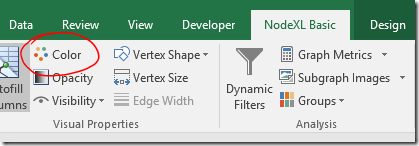
  • Check the settings under “Vertex Color Options….”.
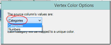
    If you are colour coding on text values choose “Categories” from the dropdown box at the top left and click OK.
  • If you want to colour code using a numerical scale, choose “Numbers” and more options will appear.
    image

View the legend

Once of the useful features of automatic colour coding is that NodeXL will generate a legend for you.

  • Show the legend at the bottom of the chart, via the NodeXL Basic ribbon > Graph Elements button.
    image

Change default node colour

Unfortunately NodeXL doesn’t allow you to choose the colours applied to each category. The first colour used is always a dark blue, which on my monitor is hard to distinguish from the default colour of black. It’s possible to change the default colour using the graph options.

  • Click the Graph Options button
    image
  • Select a new colour by double clicking the colour swatch on the Vertices tab.
    image

I encourage you to explore the other changes to default settings that are possible.


Example – Categories

Applying colour codes to categories really is as simple as selecting the column in a drop down box. This is a quick example of the type of investigation possible. Don’t forget – before you add new colours always use the option to clear the colour column or you might mix up your schemes.

Colour code matches with known branches

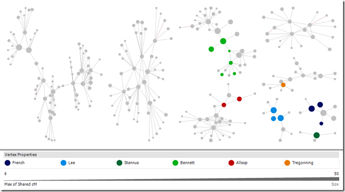
I manually added a column to the Vertices sheet labelled “Branch” and entered a surname indicating the branch for each person where the common ancestor is known. Then I clicked Autofill Columns and set my new Branch column as the vertex colour. My DNA results have a lot of very small groups. I can now easily see which branch six of them are connected to. It’s a start!

image
Kit with 125 4th or closer cousins (more distant cousins included in chart), cluster by connected component, Harel-Koren Fast Multiscale Layout with each group in it’s own box. Selected groups.

Colour code by side

I loaded both my own and my father’s matches into one file and then used a formula to mark each match as “Paternal” or “Maternal” in a new column depending on whether they shared DNA with my father. When I colour coded on the new “Side” column I could see that there was a clear division between groups, with a few strays. (Selected larger groups are shown for the sake of illustration).

This works with my tree as my branches are not inter-related and are generally from distinct populations. With a more interrelated tree it may highlight groups where it would be dangerous to make an assumption about side.

DNA matches colour coded by side (maternal, paternal)

image
Kit with 125 4th or closer cousins (more distant cousins included in chart), cluster by connected component, Harel-Koren Fast Multiscale Layout with each group in it’s own box. Selected groups.

Colour code a place

Now I want to see if I can dig in further.

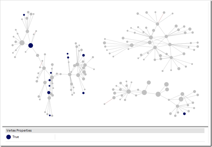
Once quarter of my father’s tree is from Cornwall. Many people have Cornish ancestry and following up on every possible Cornish lead could take me on any number of wild goose chases. Instead, using the ancestors file downloaded using the DNA Gedcom Client, I created a list of matches whose ancestors were born or died in Cornwall.

While there was an occasional individuals highlighted here and there among my groups, one group stood out. This was a group where I had not confirmed any of the relationships – the only clue I had to go on is that they are matches to my father.

I would not expect every dot in a group to be coloured as not all matches have public trees on Ancestry. If you have made a list with places or names using the ancestors file, try also searching your matches on Ancestry itself. Chances are there will be some private trees among the results. You can add their matchIDs to the import list and make use of that information.  Yes, you read right. This is a way to squeeze some information from private trees!

Note also that only one of my closer matches is marked blue indicating Cornish ancestry in a public tree. It was the trees of distant matches, which I may never have looked at otherwise, that made the difference. 

DNA matches who have any ancestor born in Cornwall highlighted

image
Kit with 125 4th or closer cousins (more distant cousins included in chart), cluster by connected component, Harel-Koren Fast Multiscale Layout with each group in it’s own box. Selected groups.

Example – Numeric information

In earlier posts we used the SharedCM column to size the dots, so that closer relatives would have bigger dots. The human brain, however, is more able to pick out colour differences than size differences, so if you are focusing on groups around your closer matches, a heatmap type display might be useful.

We can use colour to make those close cousins stand out more – the eye tends to be drawn to warm colours. In this example, closer relatives are more orange and more distant matches will be a deep purple/blue.

  • Click the Autofill Column buttons.
  • Set the Vertex colour to sharedCM. 
  • Click the options button and choose Vertex Color Options…image
  • Select Numbers in the dropdown.
  • Click Swap Colors so that closer matches will be more orange.
  • As I wanted all distant cousins to be blue I set the smallest number to 20cM.
  • I wanted all estimated 2nd cousins to be strongly orange, so I set the other extreme to 200cM.

image

I used a kit with more interconnections that my own. The result is below. In this kit there are two groupings of closer cousins. The cousins in the centre of the graph have more connections, while relatives of the group on the left seem to be less well represented in the DNA testing population.

DNA match heatmap – closer cousins are more orange

image
Kit with 470 4th or closer cousins, cousins with <15cM shared excluded, Harel-Koren Fast Multiscale Layout to set start positions, followed by two applications of the Fruchterman-Rheingold layout with repulsive force 1.0 and 3 iterations to increase the visual definition of the groups. Smaller unconnected components displayed separately at the bottom of the screen.


Where to from here?

This is the last post I have planned in this series focusing on Ancestry and NodeXL, but I doubt it will be my last post on the subject of network graphs. I’ve created a group on Facebook for discussion of Network Graphs for Genetic Genealogy. If you would like to have a conversation about what you’re doing with network graphs as they apply to genetic genealogy (regardless of the source of DNA matches or software used!) please comment below or better yet join the Facebook group.

Wednesday, August 16, 2017

Visualising Ancestry DNA matches-Part 9-Combining kits

By now those of you playing along will have created a network analysis workbook using the NodeXL template, loaded your Ancestry DNA information, broken the tangle of matches into groups, experimented with the settings and found out how you could add additional relationships. Phew! See the index to previous posts if you’re just joining in.

Now the real fun begins!

A few readers have asked if it’s possible to combine kits together. The answer is Yes! Combining kits in one file is almost as easy as loading your own information, and can be very useful.

This post assumes that you manage more than one kit, or that the owner of another kit has provided you with their files. It also assumes that your kits aren’t so large that loading more information will make the file unworkable. Save before you try it. I manage two kits at present but you can add information for as many kits as you think your computer will handle.

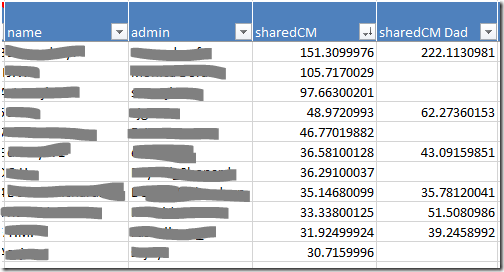
I’ve loaded my kit and my father’s kit into one worksheet. A simple edit to the matches file before loading created a new column for my father’s sharedCM values.

image

I did some quick calculations to find out how many matches we have in common. I match 50% of my father’s 4th or closer cousins. Including all the distant cousins we have a combined total of 18,889 matches – only 15% of the grand total is shared. Exercise caution if adding distant cousins!

In-common-with file

The in-common-with file will add lines representing DNA connections to your graph.

Loading an in-common-with file will also add people who are related to the additional kit’s subject. If your goal is to research the family tree of the focus person (‘you’), the best kits to load are those belonging to relatives who have some of the same ancestors as you, but no ancestors that you don’t have.

Many of the people you ‘skipped’ are prime candidates:

  • Full siblings
  • Parents
  • Aunts and uncles
  • Grandparents

This doesn’t mean that you should never load the in-common-with file for someone who has ancestors you don’t. Combining a kit with a half sibling may help you work out which matches are ‘yours, mine, or ours’. 

If you don’t load the in-common-with file you can still load the matches file to place the sharedCM values side by side as I have.

Load the ICW file

Loading the in-common with file for additional kits is easy. Simply load it in exactly as you have done before.

  • NodeXL basic ribbon, Import button, From Open Workbook…
  • Select the file in the top box
  • Under Is Edge Column tick ‘matchid’ and ‘icwid’
  • Which edge column is Vertex 1: matchid
  • Which edge column is Vertex 2: icwid


Matches file

When loading matches for an additional kit the data loaded for shared matches will overwrite existing data.

The name and admin columns have the same information regardless of which kit they match so nothing is lost by reimporting these for another person. In fact, it’s better if you do import them, otherwise you won’t know who the new matches are. 

Columns such as range, sharedCM, note and matchURL differ from kit to kit. If you want to import any of these columns (I’d import sharedCM at minimum) you’ll need to make a few minor edits to the import file first.

Prepare the matches file

  • Open the match file m_AdditionalKitName.csv
  • Save a copy with a different name. m_AdditionalKitName_edited.csv will do.
  • The matchid, name and admin columns should be left alone.
  • For any other column you want to import, change the column header to indicate whose information it is.
    For example, ‘sharedCM’ might become ‘sharedCM John’. Keep it simple because next time you update the file you’ll need to enter it in exactly the same way.
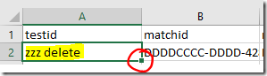
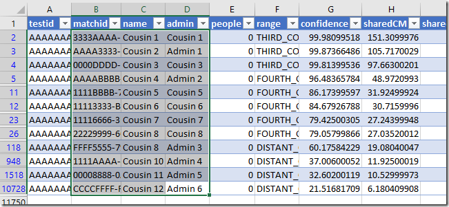
  • Choose the first value in the testid column and change it to ‘zzz delete’. Then double click on the little square in the corner of the cell to copy it all the way down the sheet. This step isn’t strictly necessary but it only takes a few seconds and will make it easier to remove extra lines not needed for the graph.
    image
  • Save the file, but don’t close it yet.


Load the matches file

  • NodeXL basic ribbon, Import button, From Open Workbook…
  • Select the file in the top box
  • Under Is Edge Column tick ‘testid’ and ‘matchid’
  • Under Is Vertex 2 Property Column tick:
    • name
    • admin
    • any other columns you wish to import (remember if the column name matches a column already present the information will be overwritten)
  • Which edge column is Vertex 1: testid
  • Which edge column is Vertex 2: matchid


Remove unwanted matches

If you decided not to load the in-common with file, you may prefer to remove matches who don’t share DNA with you. You’ll find them at the bottom of the Vertices sheet. There won’t be any information in your own sharedCM column for those people.

Housekeeping

A few clean up tasks will make sure the graph is ready for more work.

Clean up the Edges

  • If you loaded an in-common-with file, remove duplicates (NodeXL ribbon, Prepare data button).
  • On the Edges worksheet, sort the Vertex 1 column from smallest to largest using the dropdown on the column header.
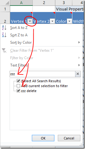
  • Filter the Vertex 1 column to only show ‘zzz delete’ entries.
    image
  • Highlight those lines and delete them.
  • Clear the filter afterwards.

Excel tips:

  • To quickly select a range of rows, select the top cell you want to include. With the Shift key held down, tap the End key and then the Down arrow.
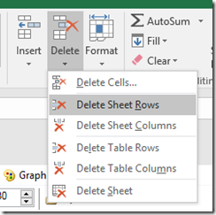
  • To delete rows, move to the Home ribbon and click the Delete button. Choose either Delete Sheet Rows or Delete Table Rows.
    image

Clean up the Vertices

There should only be one row labelled  ‘zzz delete’ to get rid of and it will be at the very bottom of the Vertices sheet. Sort the column to find it if not. You can get rid of it, or just enter ‘Skip’.

Fix up the dot sizes

Earlier, we sized the dots according to the value in the sharedCM column so that we would have a visual indication of how close the relationship with the match is. Now that you have two (or more!) sharedCM columns it’s very likely that they are scattered with blank cells. All those dots will be the default dot size.

The easiest option is to set all the dots to the same size by using the Autofill columns button to clear the size column.

Personally, I prefer having larger and smaller dots. To fill in the blanks, I added a new column to the Vertices worksheet with a formula that returns the larger of the two sharedCM values. To do this I used the MAX function. The AVERAGE function might be a good option if you have loaded several siblings.

  • Add a column to the Vertices sheet by entering a new column heading in the first empty cell in the heading row. ‘New Size’ will do for a heading.
  • Select the first empty cell in the new column.
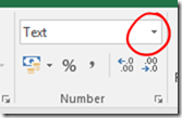
  • Move to the Home ribbon and change the cell format from ‘Text’ to ‘General’.
    image
  • Enter your preferred formula (see below if you need help). It should automatically fill in all the way down the table.

When you’re happy with the formula, use the Autofill columns button to transfer the content of your new column into the Vertex Size property.

Excel tip:

To enter the MAX or AVERAGE formula, start by typing in the formula name and an opening bracket:

=MAX( 

Then click on each cell (type a commas in between each click) that the calculation should use. You can enter as many elements as you want. Make sure you’re clicking in the same row as your formula. Finish off by entering a closing round bracket. It will look something like this:

=MAX([@sharedCM],[@[sharedCM Dad]])

Or type:

=MAX(AF3,AG3)

(check the cell references match your sheet).

Important note: Formulas and PC performance

Usually when you enter a formula in Excel it calculates so quickly that the result seems to pop up instantaneously. When you make a change in a worksheet any dependant cells (and their dependant cells and so on down the line) are recalculated in the blink of an eye.

We’ve just entered a formula all the way down a long table. This shouldn’t pose too much of a problem…. until it does. It might be when you run the grouping calculations again, or next time you load new data. With potentially tens of thousands of cells to recalculate those fractions of a second start to add up and Excel may stop responding.

There are two options to choose from that will lighten the load.

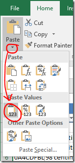
  1. Replace the formula with values: Highlight the column, Copy. Paste as values.
    image
    If you choose option 1, you’ll need to recreate the formulas when you load new data.

    OR

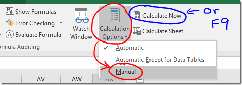
  2. Stop Excel from automatically calculating. You’ll find Calculation Options on the Formulas ribbon.
    If you do this you will need trigger recalculation of the worksheet yourself when required, either by pressing the Calculate Now button, or by pressing F9 on the keyboard.
    image
    The calculation choice will be saved with the worksheet. Be aware that any other worksheet that is open at the same time will also be affected, and the calculation choice saved for them as well. Also, the setting saved in the first workbook opened in any session is then applied to any other workbooks opened in the same session! It’s probably better to check the setting before you do anything with heavy calculations… and…. if you choose this option, remember what you have done! Formulas may look like they are working when you fill them in, but they won’t calculate correctly until you press F9.
    (In practice it’s not all quite so troublesome as it sounds).

Run clustering calculations

Did you read the important note about PC performance? Hopefully one column of formulas won’t be too much of a strain, but if you have any doubt please take one of the actions above, just in case!

Re-run the clustering algorithm of your choice and lay the graph out once more.

Explore!

In the next post I’ll show you how to colour code your matches.

Friday, August 4, 2017

Visualising Ancestry DNA matches-Part 8-Adding known ancestors

Ready for the next step? If you need to catch up, refer to the index to find your way.

So far all of the dots on the graph represent individuals, and the lines represent (believed) DNA connections. What if we expanded our idea of what the dots on the graph could represent to include ancestral couples? Then we could draw lines (which still represent DNA linkages) between matches and their known ancestors.

Example

imageJohn Tregonning and Mary Isaac are my 3xgreat-grandparents. They are also known ancestors for one of my matches. I’ve added a marker for this ancestral pair, and a line connecting their other known descendant to the marker.

I noticed that one of the other matches in the same group descended from a David Isaac – the surname caught my eye. Through a combination of building trees up and down, and by contacting private and no-tree owners, I learned that at least five matches from this group descend from David Isaac and Maryann Coomb via various of their children. I decided to also add David Isaac and Maryann Coomb to my graph as it seems likely that I have some sort of DNA connection to them.

In a perfect world where everyone had complete public trees with consistent spelling, David Isaac and Maryann Coomb should appear on Ancestry as “New Ancestor Discoveries” (except that in a perfect world they would be “New Relative Discoveries”). It’s not a perfect world and I don’t expect that kind of hint to pop up on Ancestry any time soon.

Using the graph this way helps me to not only find that information but to keep track of and visualise what I’ve found.

Adding the information

Although you can add people and relationships directly to the graph file I prefer to compile the information in a separate file (the Additional Input file) and then import it. If something goes wrong it’s much easier to delete some lines, correct a small file and reload than to unscramble a file with ten of thousands of rows.

I’ve provided instructions for both methods. I find that compiling the Ancestry match IDs is the most difficult part of the process – I’ve also provided some instructions for a shortcut that may help in making the match ID list.

Method 1: Additional Input file method

Enter the following information in the Additional Input file:

  • matchid : match’s AncestryID
  • Match name : match’s name (for reference only, not loaded)
  • Match admin : match’s admin (for reference only, not loaded)
  • Vertex 2 : ancestor’s name eg ‘John Tregonning and Mary Isaac’
    If you enter the same ancestor(s) for multiple matches, make sure the spelling, punctuation and spaces are exactly the same each time.
  • Name : as for Vertex 2
  • Vertex Type : ‘Ancestor’
  • Edge Type : ‘Ancestor’
  • If you would like to be able to apply labels for only ancestors (not for everyone) add an extra column to the file called Ancestor Label and enter their names in that column as well. image

There is some repetition here, but it will give us flexibility to do other things later.

When you import the file (NodeXL Basic ribbon, Import button, From Open Workbook…. option) choose the following options:

  • Columns have headers box should be ticked.
  • Under Is Edge Column select these (and no others)
    • matchid
    • Vertex2
    • Edge type
  • Under Is Vertex 2 Property Column select these (and no others)
    • Name
    • Vertex Type
    • Visibility (not necessary if you don’t need to update the ‘Skip’ lines for anyone)
    • Ancestor label
  • Which edge column is Vertex 1? dropdown ‘matchid’
  • Which edge column is Vertex 2? dropdown ‘Vertex 2’

Rerun the grouping and refresh the graph to see the new elements.


Method 2: Direct entry method

To add points to the graph manually you will need to add a row on the Edges worksheet for each DNA connection you want to make. That row needs two identifiers: one for the match and one for the ancestor(s). 

  • Move to the bottom of the Edges worksheet (see tip below)
  • Enter the Ancestry ID for your DNA match in a new row under the Vertex 1 column.
  • The second identifier (Vertex 2 column) should be an identifier for the known ancestor(s). Since they don’t already have an identifier just use their names – eg ‘John Tregonning and Mary Isaac’.

It doesn’t matter which identifier is Vertex 1 and which is Vertex 2, this just happens to be the convention I’ve settled on. That’s enough to create the relationship. When you refresh the graph a new row will automatically be created on the Vertices worksheet.

A little extra information will help us find those lines again if we need to and will give us more flexibility later.

  • On the Edges worksheet:
    • Add a column called Edge Type, and set the value to ‘Ancestor’ for these matches.
      image
  • On the Vertices worksheet,
    • If you haven’t refreshed the graph yet create a line for each Ancestral pair, then
    • Add the ancestor identifier (ie their names) to the Vertex column AND the Name column.
    • Add a column called Vertex Type and set the value to ‘Ancestor’ for the appropriate rows.
    • If you would like to be able to apply labels for only ancestors (not for everyone) then add another column called Ancestor Label to the Vertices worksheet and enter the ancestor identifier (ie their names) there as well.
      image

When you’re trying to link data, spelling and punctuation matter! Make sure that you enter the ancestor names 100% consistently across your matches and the two sheets.

Rerun the grouping and refresh the graph to see the new elements.

Excel tips:

To add a column, just type a label that will become the column header in the first empty cell in row 2.

To quickly move all the way to the bottom of a full column: Select any cell in the column. On your keyboard tap the End button and then the down arrow.

Shortcut for assembling Ancestry match IDs

I find that the hardest part is assembling all those Ancestry match IDs. You may be able to speed up the process by extracting the list of match IDs from your match list.

  • If using the Additional Input file (or refer to Part 2 to create one), open it up so that it is ready and waiting.
  • Open the matches file “m_YourName.csv”
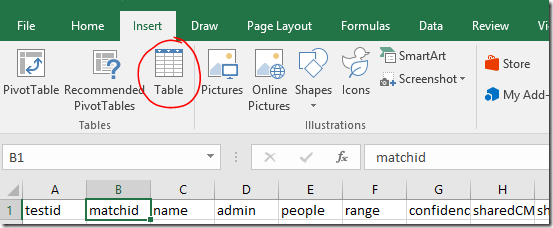
  • Select any cell within the table area. On the Insert ribbon, click Table.
    image
  • The appropriate range will be automatically selected. Make sure My table has headers is checked, and click OK.
    image
  • The appearance of the table will change and drop down filters will appear on each column header.
  • Use the drop down on the Hint column to filter for matches with a shared ancestor hint.
    image
  • Click and drag (or click and Shift-Click) to highlight all the visible rows for the matchid, name and admin columns.
  • Copy
    image
  • Switch back to the Additional input file and Paste these into the first available empty cell under matchid.
    image

Fill in the other columns as above.

Additional tip: You could filter the list to see details for people with notes, or who have the value TRUE in the ‘starred’ column, depending on how you’ve been using these.

Formatting and labelling

We added a column called Ancestor Label which contained duplicated name information. The purpose of this was to allow you to leave name labels off for your matches, but show them for ancestors if you wish. To apply the name labels use the Autofill Columns button.

Labelling tip: If you want to remove existing labels, click the arrow next to the drop down and you will find an option to clear the label column (you won’t see the change until you refresh the graph). image

I’ve applied different formatting to the Ancestor markers and lines so that it will be clear to me what they are. We’ll go into other methods in a future post – but for now you can alter them using the same method as described in the previous post.

  • Select any rows on the Vertices worksheet that contain ancestors (it may be helpful to sort the Vertex Type column if they are not all together).
  • Right click a highlighted line on the chart to access the right click menu.
  • Click Edit Selected Edge Properties… for line formatting options.
  • Select the rows again if you need to.
  • Right click a highlighted dot to access the right click menu again and click Edit Selected Vertex Properties… for marker formatting options
    OR
    Make the changes using buttons on the NodeXL ribbon.
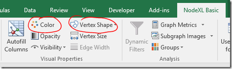
    image

I set the edge Style to ‘dot’, and the vertex Shape to ‘label’ in the example at the start of this post.

Applying the marker changes

If you’ve been following along, you’ll find that the Edge colour changes work, but Vertex colour and shape changes don’t. There’s a setting that will fix that.

To use your selected Vertex colours and shapes:

  • Select the Groups dropdown on the NodeXL Basic ribbon.
    image
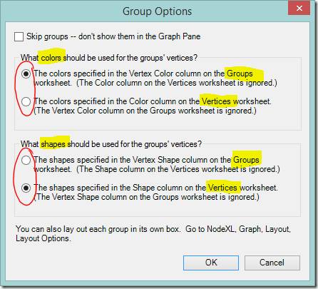
  • You’ll see an options box that directs NodeXL Basic whether to use colours and shapes from the Groups sheet, or to take them from the Vertices worksheet. If you use colours from the Vertices worksheet you’ll lose the rainbow of group colours but gain the ability to choose your own colours point by point. Shapes work similarly.
  • I elected to keep the bright group colours for now.
  • I wanted to change the shape of the marker so I changed the option under What shapes should be used for the groups’ vertices? and clicked OK.
    image

More ideas, and next steps

If you’re feeling adventurous, you might like to try adding points for non-person information such as a particular place, an unusual surname, or even an ethnicity. I’ve played with doing this. It worked quite well if the value being linked was uncommon  (‘Smith’ was a disaster!!) but ultimately I decided that colour coding these values (coming soon!) worked better for me.

The next posts are the ones that I’m really excited about showing you! They’re what I’ve been building to all this time. First we’re going to think about combining the kits we manage. Then we’ll move on to colour coding – I’ll show you how to set up colour coding schemes and switch between them at will.

Friday, July 28, 2017

Visualising Ancestry DNA matches-Part 7-Adding shared admin lines

I’ve loved seeing the comments on this blog, and posts on Facebook, describing success with these methods. Thank you for the positive feedback, and congratulations on your finds! We’re not finished yet…

If you're new to this series, the index will steer you through the previous posts.

In this post we’re going to squeeze more information from the match list. I’m going to show you how to quickly and easily see groups of kits that share the same administrator. I’m aware that Ancestry has recently made changes and in future each new adult’s kit will be registered in a separate account. I don’t know what this means for ‘admin’ data – but for now we have the information so let’s make the most of it.

The potential benefits of linking people with the same administrator are:

  • Identify clusters of closely related people within a busy graph.
  • Add relationship lines between distant (to you) matches who are closely related to each other. These connections may improve clustering calculations on a busy graph that uses distant cousins.
  • Add additional distant matches (who are not related to a fourth or closer cousin) to the graph.

Below is one of my groups. The newly created/identified edge lines are highlighted in red. I’ve had some success in asking kit administrators about the common ancestor of matches whose kits they manage.

image

Assumptions

The assumptions that we make matter. We need to be aware of the assumptions we’re making, because a wrong assumption can lead to a wrong interpretation. In this post, we’re assuming:

  • Each instance of the same administrator name is the same person.
  • All of our matches who are managed by the same administrator are related to each other.

These seem to be reasonable assumptions for my relatively sparse matches. As I investigate the groupings revealed, I can ‘skip’ lines if I think they’re not appropriate. So far I haven’t had to. This may not be the case for your kit – take due care.

Moving on – how to do this!

Add/identify shared matches with the same administrator

Once again, a few point and clicks on the right menus, and the job is done. There aren’t too many steps.

  • Click the Graph Metrics button on the NodeXL Basic ribbon.image
  • Clear the Overall graph metrics check box (it doesn’t matter if you don’t, but we’re not using them)
  • Tick the Edge creation by shared content similarity box
  • Select the Options… button
    image
  • An options box should appear. Select admin from the Analyze the contents of this column dropdown box
  • Set the Strength threshold for edge creation to 100% (we only want exact admin name matches)
    image
  • Click OK to accept the Edge Creation Metrics settings you have entered.
  • Click Calculate Metrics on the Graph Metrics dialog to start processing.

The new edges will take some time to process.

View the shared admin links

When processing finishes, Refresh the graph to apply the changes.

To see the new lines, move to the Edges worksheet. You will see a new column titled Shared Content. The newly created edges will be at the bottom of the sheet, with the relevant administrator’s name in the Shared Content column. Select all the new lines and you’ll see them highlighted in red on the graph.

If you have a graph with a lot of linkages between groups make sure that the between group links are set to show. If there are highlighted lines running between groups (and you think the assumptions we have made about administrators hold) this suggests that the clustering of matches could be improved. You may get a better result if you rerun your preferred grouping algorithm now.

Colour the new lines

The colouring instructions below are a quick fix. There are different ways to apply colour and we’ll do more with colour in a later post.

For now, highlight the rows with entries in the Shared Content column, then:

  • Right click any of the highlighted lines on the chart to access the right click menu.
    This can be a bit tricky. If you click a dot all the lines connected to that match will also be selected. Whoops! We don’t want that. If it happens, go back a step. Highlight the rows on the edges sheet, and try again.
  • Click Edit Selected Edge Properties…
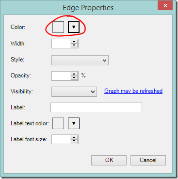
    image
  • Select the colour you prefer and click OK.
    image

You may not be able to see the colour on the graph at first. Duplicate lines in the standard grey will be sitting on top of them. This is easily fixed – just sort the Shared Content column from Z to A so that the new entries move to the top of the page. Refresh the graph.

Remove unwanted lines

Skipping

If you administer kits for cousins from different branches of your family then new, incorrect lines will have been added. These can be dealt with by finding your name in the Shared Content column and ‘Skipping’ the offending lines (enter ‘Skip’ in the Visibility column on the Edge worksheet). Deleting the edge line entirely will also work. You will need to delete the lines again each time you recreate the shared admin links.

Alternative:
You can use a formula to specify the lines that should be skipped. The template uses Excel tables, which have special properties. If the Visibility column is all clear and you enter a formula it will automatically be entered into every row including new rows that are added later. No updating required.
You might have already noticed that some cells have a red triangle in the corner. When you hover over these cells a comment box will appear. The comment boxes contain useful information about use of each column and what the possible values mean. image

Taking a simple case where “YOURNAME” is the only value in the Shared Content column that you want to skip, a formula that will do the job is:

=IF([@[Shared Content]]="YOURNAME",0,1)

This formula tells Excel that if the value in the Shared Content column is ‘YOURNAME’ the value should be ‘0’ (which we can see from the comment box means ‘Skip’). Otherwise, the value is ‘1’ (which means ‘Show’).

Deleting

If you find that the shared admin lines are not suitable for your situation at all, simply delete the lines entirely. You won’t need the now empty Shared Content column – it can also be deleted.

Excel tip:
To remove the lines select any cell(s) in the row(s) you want to remove. On the Home ribbon click Delete, Delete Sheet Rows. This won’t work if you have filtered the table to find the rows.  

image

Retain wanted information

When you ‘count and merge duplicate edges’ the first instance of an edge (starting from the top) is kept. Duplicates further down the sheet will be deleted – even if they add information such as Shared Content or 'skip’ instructions.

To make sure you retain the new admin lines when removing duplicates send them to the top of the worksheet.

  • Sort the Shared Content column from largest to smallest, then
  • Sort the Visibility column so that skip instructions are at the top
    • If using words in the Visibility column, sort from largest to smallest
    • If using a formula that results in a number, sort from smallest to largest

Then remove duplicates as usual.

Note:
You can also use the Shared Content column (or any other column) in addition to the vertices to determine if two edges match. This is useful to tell the difference between relationships from the ICW data, and relationships that were created only through having a shared administrator.
image

Coming up….

In the next post, we’ll supplement the graph with known ancestry information.