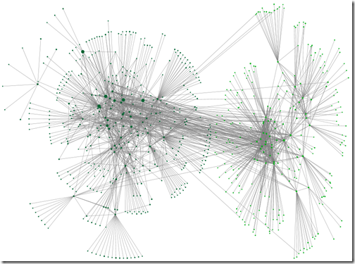
Our computers have to crunch a lot of numbers to make up these graphs. Even more so for a busy one. If you haven’t cleared duplicate relationships since you last loaded data (or ever!) head back to Post 4 and do this step now.
In writing these posts I’ve tried to choose a path that will be both useful and accessible to as many people as possible. The options I’ve chosen and methods I’ve used may not be the ones that work best for you. The choices you make should be driven by the nature of your tree and your research goals.
Before you try and clean up a busy graph, you need to understand why it’s busy. You’ll have a big head start on both understanding the relationships it shows, and what you would lose or gain by removing certain elements from the graph.
Sincere thanks to Blaine Bettinger, Joan Hanlon and Richard Rubin who allowed me to use their data to test the suggestions in this post. Thank you also to the several other people who offered me their data for the same purpose.
Why is the graph busy?
I have used one of Joan’s kits for demonstration purposes. The kit has 469 fourth cousin or closer matches. Below is the point reached, having followed the steps in earlier parts of this series.
The start point
Let’s take a closer look.
Distant relatives
Many of the groups have a cluster of interconnected closer relatives with a fringe of distant relatives. You can see the fringes quite clearly on the left of this group.
A group with a fringe of distant relatives.
Group interconnections
There’s a network of between-group streaks across the graph. In areas where these are thicker, it’s hard to tell where the streaks start and end. They obscure the relationships within groupings. We can work out where those linkages are coming from.
Interconnections from close cousins
As I click on each row of the Vertices worksheet, that person’s relationship lines are highlighted in red. I can see that some of the strong streaks between groups are due to a small number of closer relatives.
Connections from a third cousin are highlighted in the image below. This is gold! If Joan knows how that third cousin is related to the focus person, it will suggest what part of the tree those two groups are connected to. It works the other way around too. Clues from those two groups could lead to discovering how the predicted third cousin fits in.
This third cousin has strong connections to two other groups
The number of lines from even a few first or second cousins, who will probably match with multiple people in other groups, may be enough to obscure what is going on in a graph.
Group interconnections – other linkages
If I move to the Groups worksheet, I can now click on each group in turn. All the people in the group and each of their relationships with other people, will be highlighted. The group below has linkages spread out to many other groups.
Remember that the relationship between two of your DNA matches may have nothing to do with your tree. It’s very likely that some of your DNA matches will be related to each other on other lines. While there are slightly more connections to the dark blue group, there’s nothing here that screams of a strong relationship between groups.
On the other hand, the group at the top has multiple connections to the green group in the lower left hand corner (see below). It’s easy to imagine that the division of people between those two groups could change with a few new cousins added, or a slightly different grouping algorithm.
A prolific branch?
On the Groups worksheet I marked the Visibility column for all of the groups, except the two mentioned above, with the word ‘skip’. I Refreshed the graph and adjusted the Scale slider to see this:
It’s a bit hard to show it here – you’ll have to take my word for it – but it appears that there are perhaps half a dozen people at the furthest end of the the fourth cousin range with multiple connections to both groups. I found it interesting that the strong connection wasn’t driven by closer cousins. The group on the right also are more distantly related to the focus person, on average, than the group on the left. Perhaps a more distant, but prolific, line of descent from the same branch? Only research will tell.
Endogamy
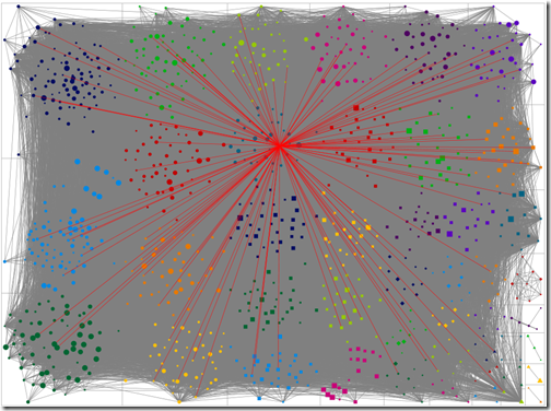
If you are from an endogamous population, and your computer survives the journey to making a graph, you will find yourself with dots on a solid mat of grey. The following graph is from a person known to have some endogamy. Only fourth cousins and closer have been included in the graph. Almost any vertex I click on connects to multiple groups – I’m not at all sure that the groupings are meaningful in this case. In the bottom right hand corner, a few clusters from the less endogamous portions of the tree peek out.
If you looked at graphs in earlier post, you’ll know this is far removed from my own. I take back any complaint I may have made about not having enough matches!
Cleaning the clutter
So we’ve rummaged around in the clutter and found some items that should go, and a few we’d like to keep.
What next?
The next post…


![image_thumb7[1] image_thumb7[1]](https://blogger.googleusercontent.com/img/b/R29vZ2xl/AVvXsEgSUGAPWmJDI7YEsKD0iQWUA6FttdTgb5-n5p0XreP0-rUhUOmeBPNEE-PXm8JBjQIIqfpM6KWwawLR3BvI7MqFeBvxKJyakiXEWxgaEsk6LNuAgChkDu2NVSrPVdMrg11UufnKTnptqxl0/?imgmax=800)


No comments:
Post a Comment