Blog post

Tuesday, August 22, 2017

Researching Abroad Roadshow–Canberra

Yesterday I attended the Researching Abroad Roadshow. Canberra’s event was one day only, with the British Isles and German/European streams running in different rooms.

I chose the British Isles stream, as it reflects my ancestry. We started the day with Scottish land records, and Scottish research resources before 1800 and after lunch moved on to Irish family history resources online and “Down and out in Scotland”.

When a speech focuses on types of records there’s a danger that the presenter will spend a lot of time rattling off lists. I’ve seen it happen before. Fortunately, this this was not the case yesterday. Chris Paton was an engaging speaker with plenty of examples that related the records back to the real people and events they describe.

I had looked at some of the resources that were covered before, but not in any depth, and others were completely new to me. I now feel that I have a head start on knowing where to look and what I might find when I’m ready to dig into Scottish and Irish research. Learning how to pronounce all those Scottish and Irish words might take a bit longer!

Chris very kindly indulged me with a quick selfie as he was racing off for the airport.

selfie

The Roadshow has two more stops, in Adelaide and in Perth. Get to it if you can!


Disclosure: In return for acting as a Roadshow Ambassador I received free entry to the event.


Wednesday, August 16, 2017

Visualising Ancestry DNA matches-Part 9-Combining kits

By now those of you playing along will have created a network analysis workbook using the NodeXL template, loaded your Ancestry DNA information, broken the tangle of matches into groups, experimented with the settings and found out how you could add additional relationships. Phew! See the index to previous posts if you’re just joining in.

Now the real fun begins!

A few readers have asked if it’s possible to combine kits together. The answer is Yes! Combining kits in one file is almost as easy as loading your own information, and can be very useful.

This post assumes that you manage more than one kit, or that the owner of another kit has provided you with their files. It also assumes that your kits aren’t so large that loading more information will make the file unworkable. Save before you try it. I manage two kits at present but you can add information for as many kits as you think your computer will handle.

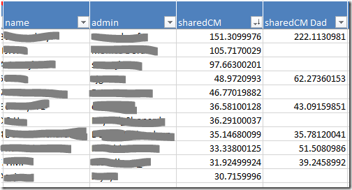
I’ve loaded my kit and my father’s kit into one worksheet. A simple edit to the matches file before loading created a new column for my father’s sharedCM values.

image

I did some quick calculations to find out how many matches we have in common. I match 50% of my father’s 4th or closer cousins. Including all the distant cousins we have a combined total of 18,889 matches – only 15% of the grand total is shared. Exercise caution if adding distant cousins!

In-common-with file

The in-common-with file will add lines representing DNA connections to your graph.

Loading an in-common-with file will also add people who are related to the additional kit’s subject. If your goal is to research the family tree of the focus person (‘you’), the best kits to load are those belonging to relatives who have some of the same ancestors as you, but no ancestors that you don’t have.

Many of the people you ‘skipped’ are prime candidates:

  • Full siblings
  • Parents
  • Aunts and uncles
  • Grandparents

This doesn’t mean that you should never load the in-common-with file for someone who has ancestors you don’t. Combining a kit with a half sibling may help you work out which matches are ‘yours, mine, or ours’. 

If you don’t load the in-common-with file you can still load the matches file to place the sharedCM values side by side as I have.

Load the ICW file

Loading the in-common with file for additional kits is easy. Simply load it in exactly as you have done before.

  • NodeXL basic ribbon, Import button, From Open Workbook…
  • Select the file in the top box
  • Under Is Edge Column tick ‘matchid’ and ‘icwid’
  • Which edge column is Vertex 1: matchid
  • Which edge column is Vertex 2: icwid


Matches file

When loading matches for an additional kit the data loaded for shared matches will overwrite existing data.

The name and admin columns have the same information regardless of which kit they match so nothing is lost by reimporting these for another person. In fact, it’s better if you do import them, otherwise you won’t know who the new matches are. 

Columns such as range, sharedCM, note and matchURL differ from kit to kit. If you want to import any of these columns (I’d import sharedCM at minimum) you’ll need to make a few minor edits to the import file first.

Prepare the matches file

  • Open the match file m_AdditionalKitName.csv
  • Save a copy with a different name. m_AdditionalKitName_edited.csv will do.
  • The matchid, name and admin columns should be left alone.
  • For any other column you want to import, change the column header to indicate whose information it is.
    For example, ‘sharedCM’ might become ‘sharedCM John’. Keep it simple because next time you update the file you’ll need to enter it in exactly the same way.
  • Choose the first value in the testid column and change it to ‘zzz delete’. Then double click on the little square in the corner of the cell to copy it all the way down the sheet. This step isn’t strictly necessary but it only takes a few seconds and will make it easier to remove extra lines not needed for the graph.
    image
  • Save the file, but don’t close it yet.


Load the matches file

  • NodeXL basic ribbon, Import button, From Open Workbook…
  • Select the file in the top box
  • Under Is Edge Column tick ‘testid’ and ‘matchid’
  • Under Is Vertex 2 Property Column tick:
    • name
    • admin
    • any other columns you wish to import (remember if the column name matches a column already present the information will be overwritten)
  • Which edge column is Vertex 1: testid
  • Which edge column is Vertex 2: matchid


Remove unwanted matches

If you decided not to load the in-common with file, you may prefer to remove matches who don’t share DNA with you. You’ll find them at the bottom of the Vertices sheet. There won’t be any information in your own sharedCM column for those people.

Housekeeping

A few clean up tasks will make sure the graph is ready for more work.

Clean up the Edges

  • If you loaded an in-common-with file, remove duplicates (NodeXL ribbon, Prepare data button).
  • On the Edges worksheet, sort the Vertex 1 column from smallest to largest using the dropdown on the column header.
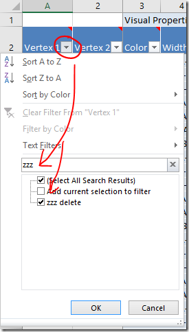
  • Filter the Vertex 1 column to only show ‘zzz delete’ entries.
    image
  • Highlight those lines and delete them.
  • Clear the filter afterwards.

Excel tips:

  • To quickly select a range of rows, select the top cell you want to include. With the Shift key held down, tap the End key and then the Down arrow.
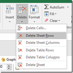
  • To delete rows, move to the Home ribbon and click the Delete button. Choose either Delete Sheet Rows or Delete Table Rows.
    image

Clean up the Vertices

There should only be one row labelled  ‘zzz delete’ to get rid of and it will be at the very bottom of the Vertices sheet. Sort the column to find it if not. You can get rid of it, or just enter ‘Skip’.

Fix up the dot sizes

Earlier, we sized the dots according to the value in the sharedCM column so that we would have a visual indication of how close the relationship with the match is. Now that you have two (or more!) sharedCM columns it’s very likely that they are scattered with blank cells. All those dots will be the default dot size.

The easiest option is to set all the dots to the same size by using the Autofill columns button to clear the size column.

Personally, I prefer having larger and smaller dots. To fill in the blanks, I added a new column to the Vertices worksheet with a formula that returns the larger of the two sharedCM values. To do this I used the MAX function. The AVERAGE function might be a good option if you have loaded several siblings.

  • Add a column to the Vertices sheet by entering a new column heading in the first empty cell in the heading row. ‘New Size’ will do for a heading.
  • Select the first empty cell in the new column.
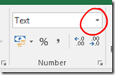
  • Move to the Home ribbon and change the cell format from ‘Text’ to ‘General’.
    image
  • Enter your preferred formula (see below if you need help). It should automatically fill in all the way down the table.

When you’re happy with the formula, use the Autofill columns button to transfer the content of your new column into the Vertex Size property.

Excel tip:

To enter the MAX or AVERAGE formula, start by typing in the formula name and an opening bracket:

=MAX( 

Then click on each cell (type a commas in between each click) that the calculation should use. You can enter as many elements as you want. Make sure you’re clicking in the same row as your formula. Finish off by entering a closing round bracket. It will look something like this:

=MAX([@sharedCM],[@[sharedCM Dad]])

Or type:

=MAX(AF3,AG3)

(check the cell references match your sheet).

Important note: Formulas and PC performance

Usually when you enter a formula in Excel it calculates so quickly that the result seems to pop up instantaneously. When you make a change in a worksheet any dependant cells (and their dependant cells and so on down the line) are recalculated in the blink of an eye.

We’ve just entered a formula all the way down a long table. This shouldn’t pose too much of a problem…. until it does. It might be when you run the grouping calculations again, or next time you load new data. With potentially tens of thousands of cells to recalculate those fractions of a second start to add up and Excel may stop responding.

There are two options to choose from that will lighten the load.

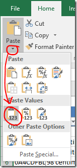
  1. Replace the formula with values: Highlight the column, Copy. Paste as values.
    image
    If you choose option 1, you’ll need to recreate the formulas when you load new data.

    OR

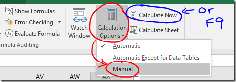
  2. Stop Excel from automatically calculating. You’ll find Calculation Options on the Formulas ribbon.
    If you do this you will need trigger recalculation of the worksheet yourself when required, either by pressing the Calculate Now button, or by pressing F9 on the keyboard.
    image
    The calculation choice will be saved with the worksheet. Be aware that any other worksheet that is open at the same time will also be affected, and the calculation choice saved for them as well. Also, the setting saved in the first workbook opened in any session is then applied to any other workbooks opened in the same session! It’s probably better to check the setting before you do anything with heavy calculations… and…. if you choose this option, remember what you have done! Formulas may look like they are working when you fill them in, but they won’t calculate correctly until you press F9.
    (In practice it’s not all quite so troublesome as it sounds).

Run clustering calculations

Did you read the important note about PC performance? Hopefully one column of formulas won’t be too much of a strain, but if you have any doubt please take one of the actions above, just in case!

Re-run the clustering algorithm of your choice and lay the graph out once more.

Explore!

In the next post I’ll show you how to colour code your matches.

Friday, August 4, 2017

Visualising Ancestry DNA matches-Part 8-Adding known ancestors

Ready for the next step? If you need to catch up, refer to the index to find your way.

So far all of the dots on the graph represent individuals, and the lines represent (believed) DNA connections. What if we expanded our idea of what the dots on the graph could represent to include ancestral couples? Then we could draw lines (which still represent DNA linkages) between matches and their known ancestors.

Example

imageJohn Tregonning and Mary Isaac are my 3xgreat-grandparents. They are also known ancestors for one of my matches. I’ve added a marker for this ancestral pair, and a line connecting their other known descendant to the marker.

I noticed that one of the other matches in the same group descended from a David Isaac – the surname caught my eye. Through a combination of building trees up and down, and by contacting private and no-tree owners, I learned that at least five matches from this group descend from David Isaac and Maryann Coomb via various of their children. I decided to also add David Isaac and Maryann Coomb to my graph as it seems likely that I have some sort of DNA connection to them.

In a perfect world where everyone had complete public trees with consistent spelling, David Isaac and Maryann Coomb should appear on Ancestry as “New Ancestor Discoveries” (except that in a perfect world they would be “New Relative Discoveries”). It’s not a perfect world and I don’t expect that kind of hint to pop up on Ancestry any time soon.

Using the graph this way helps me to not only find that information but to keep track of and visualise what I’ve found.

Adding the information

Although you can add people and relationships directly to the graph file I prefer to compile the information in a separate file (the Additional Input file) and then import it. If something goes wrong it’s much easier to delete some lines, correct a small file and reload than to unscramble a file with ten of thousands of rows.

I’ve provided instructions for both methods. I find that compiling the Ancestry match IDs is the most difficult part of the process – I’ve also provided some instructions for a shortcut that may help in making the match ID list.

Method 1: Additional Input file method

Enter the following information in the Additional Input file:

  • matchid : match’s AncestryID
  • Match name : match’s name (for reference only, not loaded)
  • Match admin : match’s admin (for reference only, not loaded)
  • Vertex 2 : ancestor’s name eg ‘John Tregonning and Mary Isaac’
    If you enter the same ancestor(s) for multiple matches, make sure the spelling, punctuation and spaces are exactly the same each time.
  • Name : as for Vertex 2
  • Vertex Type : ‘Ancestor’
  • Edge Type : ‘Ancestor’
  • If you would like to be able to apply labels for only ancestors (not for everyone) add an extra column to the file called Ancestor Label and enter their names in that column as well. image

There is some repetition here, but it will give us flexibility to do other things later.

When you import the file (NodeXL Basic ribbon, Import button, From Open Workbook…. option) choose the following options:

  • Columns have headers box should be ticked.
  • Under Is Edge Column select these (and no others)
    • matchid
    • Vertex2
    • Edge type
  • Under Is Vertex 2 Property Column select these (and no others)
    • Name
    • Vertex Type
    • Visibility (not necessary if you don’t need to update the ‘Skip’ lines for anyone)
    • Ancestor label
  • Which edge column is Vertex 1? dropdown ‘matchid’
  • Which edge column is Vertex 2? dropdown ‘Vertex 2’

Rerun the grouping and refresh the graph to see the new elements.


Method 2: Direct entry method

To add points to the graph manually you will need to add a row on the Edges worksheet for each DNA connection you want to make. That row needs two identifiers: one for the match and one for the ancestor(s). 

  • Move to the bottom of the Edges worksheet (see tip below)
  • Enter the Ancestry ID for your DNA match in a new row under the Vertex 1 column.
  • The second identifier (Vertex 2 column) should be an identifier for the known ancestor(s). Since they don’t already have an identifier just use their names – eg ‘John Tregonning and Mary Isaac’.

It doesn’t matter which identifier is Vertex 1 and which is Vertex 2, this just happens to be the convention I’ve settled on. That’s enough to create the relationship. When you refresh the graph a new row will automatically be created on the Vertices worksheet.

A little extra information will help us find those lines again if we need to and will give us more flexibility later.

  • On the Edges worksheet:
    • Add a column called Edge Type, and set the value to ‘Ancestor’ for these matches.
      image
  • On the Vertices worksheet,
    • If you haven’t refreshed the graph yet create a line for each Ancestral pair, then
    • Add the ancestor identifier (ie their names) to the Vertex column AND the Name column.
    • Add a column called Vertex Type and set the value to ‘Ancestor’ for the appropriate rows.
    • If you would like to be able to apply labels for only ancestors (not for everyone) then add another column called Ancestor Label to the Vertices worksheet and enter the ancestor identifier (ie their names) there as well.
      image

When you’re trying to link data, spelling and punctuation matter! Make sure that you enter the ancestor names 100% consistently across your matches and the two sheets.

Rerun the grouping and refresh the graph to see the new elements.

Excel tips:

To add a column, just type a label that will become the column header in the first empty cell in row 2.

To quickly move all the way to the bottom of a full column: Select any cell in the column. On your keyboard tap the End button and then the down arrow.

Shortcut for assembling Ancestry match IDs

I find that the hardest part is assembling all those Ancestry match IDs. You may be able to speed up the process by extracting the list of match IDs from your match list.

  • If using the Additional Input file (or refer to Part 2 to create one), open it up so that it is ready and waiting.
  • Open the matches file “m_YourName.csv”
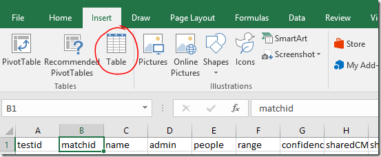
  • Select any cell within the table area. On the Insert ribbon, click Table.
    image
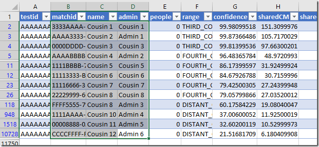
  • The appropriate range will be automatically selected. Make sure My table has headers is checked, and click OK.
    image
  • The appearance of the table will change and drop down filters will appear on each column header.
  • Use the drop down on the Hint column to filter for matches with a shared ancestor hint.
    image
  • Click and drag (or click and Shift-Click) to highlight all the visible rows for the matchid, name and admin columns.
  • Copy
    image
  • Switch back to the Additional input file and Paste these into the first available empty cell under matchid.
    image

Fill in the other columns as above.

Additional tip: You could filter the list to see details for people with notes, or who have the value TRUE in the ‘starred’ column, depending on how you’ve been using these.

Formatting and labelling

We added a column called Ancestor Label which contained duplicated name information. The purpose of this was to allow you to leave name labels off for your matches, but show them for ancestors if you wish. To apply the name labels use the Autofill Columns button.

Labelling tip: If you want to remove existing labels, click the arrow next to the drop down and you will find an option to clear the label column (you won’t see the change until you refresh the graph). image

I’ve applied different formatting to the Ancestor markers and lines so that it will be clear to me what they are. We’ll go into other methods in a future post – but for now you can alter them using the same method as described in the previous post.

  • Select any rows on the Vertices worksheet that contain ancestors (it may be helpful to sort the Vertex Type column if they are not all together).
  • Right click a highlighted line on the chart to access the right click menu.
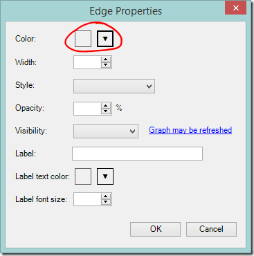
  • Click Edit Selected Edge Properties… for line formatting options.
  • Select the rows again if you need to.
  • Right click a highlighted dot to access the right click menu again and click Edit Selected Vertex Properties… for marker formatting options
    OR
    Make the changes using buttons on the NodeXL ribbon.
    image

I set the edge Style to ‘dot’, and the vertex Shape to ‘label’ in the example at the start of this post.

Applying the marker changes

If you’ve been following along, you’ll find that the Edge colour changes work, but Vertex colour and shape changes don’t. There’s a setting that will fix that.

To use your selected Vertex colours and shapes:

  • Select the Groups dropdown on the NodeXL Basic ribbon.
    image
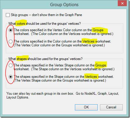
  • You’ll see an options box that directs NodeXL Basic whether to use colours and shapes from the Groups sheet, or to take them from the Vertices worksheet. If you use colours from the Vertices worksheet you’ll lose the rainbow of group colours but gain the ability to choose your own colours point by point. Shapes work similarly.
  • I elected to keep the bright group colours for now.
  • I wanted to change the shape of the marker so I changed the option under What shapes should be used for the groups’ vertices? and clicked OK.
    image

More ideas, and next steps

If you’re feeling adventurous, you might like to try adding points for non-person information such as a particular place, an unusual surname, or even an ethnicity. I’ve played with doing this. It worked quite well if the value being linked was uncommon  (‘Smith’ was a disaster!!) but ultimately I decided that colour coding these values (coming soon!) worked better for me.

The next posts are the ones that I’m really excited about showing you! They’re what I’ve been building to all this time. First we’re going to think about combining the kits we manage. Then we’ll move on to colour coding – I’ll show you how to set up colour coding schemes and switch between them at will.

Friday, July 28, 2017

Visualising Ancestry DNA matches-Part 7-Adding shared admin lines

I’ve loved seeing the comments on this blog, and posts on Facebook, describing success with these methods. Thank you for the positive feedback, and congratulations on your finds! We’re not finished yet…

If you're new to this series, the index will steer you through the previous posts.

In this post we’re going to squeeze more information from the match list. I’m going to show you how to quickly and easily see groups of kits that share the same administrator. I’m aware that Ancestry has recently made changes and in future each new adult’s kit will be registered in a separate account. I don’t know what this means for ‘admin’ data – but for now we have the information so let’s make the most of it.

The potential benefits of linking people with the same administrator are:

  • Identify clusters of closely related people within a busy graph.
  • Add relationship lines between distant (to you) matches who are closely related to each other. These connections may improve clustering calculations on a busy graph that uses distant cousins.
  • Add additional distant matches (who are not related to a fourth or closer cousin) to the graph.

Below is one of my groups. The newly created/identified edge lines are highlighted in red. I’ve had some success in asking kit administrators about the common ancestor of matches whose kits they manage.

image

Assumptions

The assumptions that we make matter. We need to be aware of the assumptions we’re making, because a wrong assumption can lead to a wrong interpretation. In this post, we’re assuming:

  • Each instance of the same administrator name is the same person.
  • All of our matches who are managed by the same administrator are related to each other.

These seem to be reasonable assumptions for my relatively sparse matches. As I investigate the groupings revealed, I can ‘skip’ lines if I think they’re not appropriate. So far I haven’t had to. This may not be the case for your kit – take due care.

Moving on – how to do this!

Add/identify shared matches with the same administrator

Once again, a few point and clicks on the right menus, and the job is done. There aren’t too many steps.

  • Click the Graph Metrics button on the NodeXL Basic ribbon.image
  • Clear the Overall graph metrics check box (it doesn’t matter if you don’t, but we’re not using them)
  • Tick the Edge creation by shared content similarity box
  • Select the Options… button
    image
  • An options box should appear. Select admin from the Analyze the contents of this column dropdown box
  • Set the Strength threshold for edge creation to 100% (we only want exact admin name matches)
    image
  • Click OK to accept the Edge Creation Metrics settings you have entered.
  • Click Calculate Metrics on the Graph Metrics dialog to start processing.

The new edges will take some time to process.

View the shared admin links

When processing finishes, Refresh the graph to apply the changes.

To see the new lines, move to the Edges worksheet. You will see a new column titled Shared Content. The newly created edges will be at the bottom of the sheet, with the relevant administrator’s name in the Shared Content column. Select all the new lines and you’ll see them highlighted in red on the graph.

If you have a graph with a lot of linkages between groups make sure that the between group links are set to show. If there are highlighted lines running between groups (and you think the assumptions we have made about administrators hold) this suggests that the clustering of matches could be improved. You may get a better result if you rerun your preferred grouping algorithm now.

Colour the new lines

The colouring instructions below are a quick fix. There are different ways to apply colour and we’ll do more with colour in a later post.

For now, highlight the rows with entries in the Shared Content column, then:

  • Right click any of the highlighted lines on the chart to access the right click menu.
    This can be a bit tricky. If you click a dot all the lines connected to that match will also be selected. Whoops! We don’t want that. If it happens, go back a step. Highlight the rows on the edges sheet, and try again.
  • Click Edit Selected Edge Properties…
    image
  • Select the colour you prefer and click OK.
    image

You may not be able to see the colour on the graph at first. Duplicate lines in the standard grey will be sitting on top of them. This is easily fixed – just sort the Shared Content column from Z to A so that the new entries move to the top of the page. Refresh the graph.

Remove unwanted lines

Skipping

If you administer kits for cousins from different branches of your family then new, incorrect lines will have been added. These can be dealt with by finding your name in the Shared Content column and ‘Skipping’ the offending lines (enter ‘Skip’ in the Visibility column on the Edge worksheet). Deleting the edge line entirely will also work. You will need to delete the lines again each time you recreate the shared admin links.

Alternative:
You can use a formula to specify the lines that should be skipped. The template uses Excel tables, which have special properties. If the Visibility column is all clear and you enter a formula it will automatically be entered into every row including new rows that are added later. No updating required.

You might have already noticed that some cells have a red triangle in the corner. When you hover over these cells a comment box will appear. The comment boxes contain useful information about use of each column and what the possible values mean. image

Taking a simple case where “YOURNAME” is the only value in the Shared Content column that you want to skip, a formula that will do the job is:

=IF([@[Shared Content]]="YOURNAME",0,1)

This formula tells Excel that if the value in the Shared Content column is ‘YOURNAME’ the value should be ‘0’ (which we can see from the comment box means ‘Skip’). Otherwise, the value is ‘1’ (which means ‘Show’).

Deleting

If you find that the shared admin lines are not suitable for your situation at all, simply delete the lines entirely. You won’t need the now empty Shared Content column – it can also be deleted.

Excel tip:
To remove the lines select any cell(s) in the row(s) you want to remove. On the Home ribbon click Delete, Delete Sheet Rows. This won’t work if you have filtered the table to find the rows.  

image

Retain wanted information

When you ‘count and merge duplicate edges’ the first instance of an edge (starting from the top) is kept. Duplicates further down the sheet will be deleted – even if they add information such as Shared Content or 'skip’ instructions.

To make sure you retain the new admin lines when removing duplicates send them to the top of the worksheet.

  • Sort the Shared Content column from largest to smallest, then
  • Sort the Visibility column so that skip instructions are at the top
    • If using words in the Visibility column, sort from largest to smallest
    • If using a formula that results in a number, sort from smallest to largest

Then remove duplicates as usual.

Note:
You can also use the Shared Content column (or any other column) in addition to the vertices to determine if two edges match. This is useful to tell the difference between relationships from the ICW data, and relationships that were created only through having a shared administrator.
image

Coming up….

In the next post, we’ll supplement the graph with known ancestry information.


Sunday, July 23, 2017

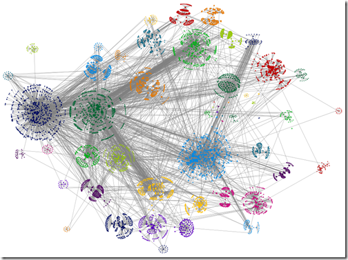
Visualising Ancestry DNA matches-Part 6-Busy graph treatments

In the last post we cast an appraising eye over the graphs we made using NodeXL Basic (a product of the ‘Social Media Research Foundation’). In this post, you’ll see some of the features of that may help calm a busy graph. Pick and choose from them as appropriate to you tree, research aims and aesthetic preferences.

If you haven’t made a graph yet, see the index to this series for earlier posts.

Display settings

Take it one group at a time

Once you’ve made groups, you can move to the Groups worksheet and enter ‘skip’ in the Visibility column for each group except the one(s) that you’re interested in. Click Refresh, and only the unskipped groups will be shown. You can also view a few groups at a time as I did in the previous post.

Reduce edge opacity

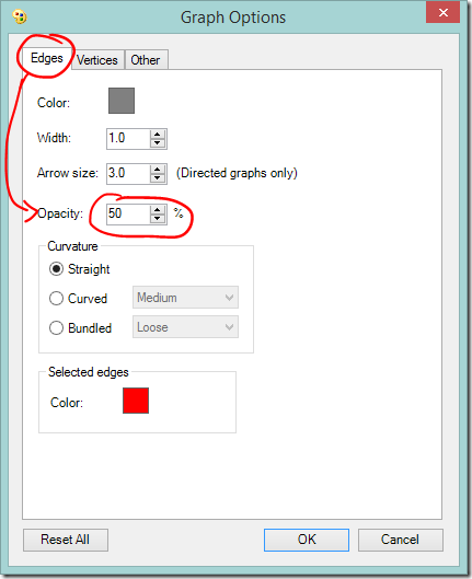
If there are a lot of crossing lines it might be easier to work with the graph if you reduce the line opacity. You can change the defaults used for the graph, including the edge opacity via the Graph Options button.

  • Click the Graph Options button
    image
  • Lower the default Edges Opacity – the lower the opacity, the more transparent the line.
    This may not remove as much visual clutter as you want, but if the dots appear to be sitting on a blanket of grey it may help you see some structure.
    image

Swap labels for tooltips

In Part 3 we used the Autofill columns button on the NodeXL ribbon to add labels to the graph. For a busy graph you may prefer to use same button to clear the labels column and set the tooltip to ‘name’. That way you’ll see the match’s name by hovering over their dot.

Grouping

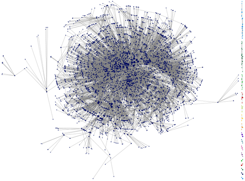
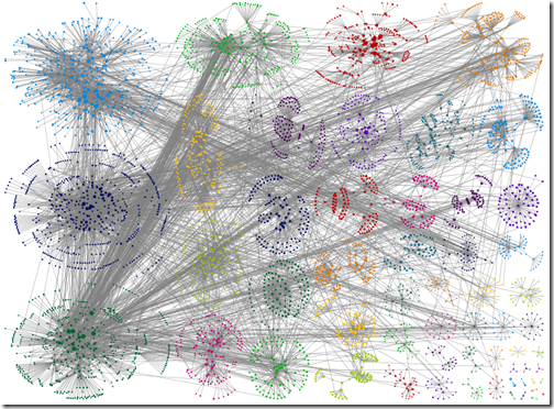
If your groups don’t break up nicely, try a different clustering algorithm.

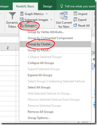
  • On the NodeXL Ribbon select Groups, Group by Cluster…
    image
  • Select an option from those presented and click OK. The calculations may take some time for a complex graph.
  • Refresh Graph to apply the new groupings.

image

Clauset-Newman-Moore clustering algorithm
image
Same graph with Wakita-Tsurumi clustering algorithm

Remember that these algorithms were not created with your DNA results in mind! Hopefully one of them will work well with your data – but don’t assume that because it sounds scientific it must be right.

Try a different group box layout – or none at all

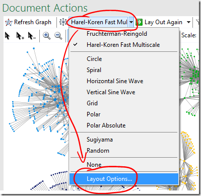
  • Different group box layout options are available under ‘Layout Options’ on the graph area or main NodeXL ribbon, bottom item Layout Options…
    image


image

‘Force-directed’ box layout algorithm used, box edge width 0 (I.e. no line)

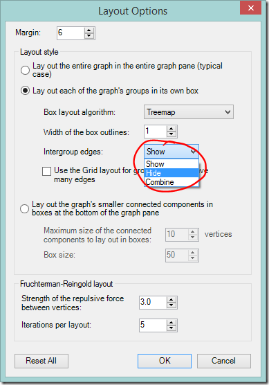
Hide intergroup connections

It’s possible to hide all the the lines that run between different groups. This instantly cleans up a graph and makes connections within a group easier to see, but does so at the expense of between-group information.

  • Click the Layout options dropdown on the NodeXL Ribbon or the graph area toolbar.
  • Change Intergroup edges to ‘Hide’.

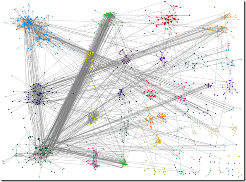
image

image

Intragroup edges hidden

The graph with between group edges hidden is clean and pretty. It’s easier to see relationships within groups – but relationships between groups are not visible. Again, that reminder that the grouping algorithms were not designed for your DNA data. Those between group connections may be the clue that points you in the right direction.

Alternative: ‘Combine’ is an interesting option to try. It will draw a single, thick line between groups that interlink with each other.

Removing relatives

Skipping close relatives

When we created the Additional Input file we added the word ‘Skip’ to the Visibility column for you and your very close family. The ‘Skip’ direction tells NodeXL not to include that person in the graph, or in the clustering calculations.

It may be helpful to ‘Skip’ some more of your close relatives, especially if PC performance is an issue. Take care though – skipping a relative means the graph loses information.

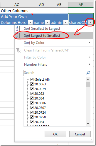
  • Your closest relatives are probably at the top of the the Vertices worksheet. If not, sort the sharedCM column from largest to smallest using the dropdown. Your closest relatives will move to the top of the list.
    image
  • When you click on the row for a match, the dot that represents that person, and all the lines representing their relationships, will be highlighted in red. This will give you a sense of how widely spread their linkages are, and how much clutter will be cleared (or information lost) by skipping them.

There’s no magic number for the relationship distance or number of links that should be the threshold for skipping people. If I had an aunt and a second cousin who had the same number of links, I might skip the aunt, since theoretically her links are spread over half my tree. I would be much more likely to leave in the second cousin whose matches theoretically sit in a quarter of my tree.

As many readers have realised, you can ‘Skip’ people manually by entering ‘Skip’ in the Visibility column. However, I suggest that you also add the new ‘skip’ line to the Additional Input file as explained in Part 2 (note that the directions on this point have been revised since first posting). If something goes wrong, troubleshooting a large file with complex relationships can be difficult. Keeping the information in a smaller external file makes it easier remember what you’ve done, and allows you to reload or start again if necessary.

Note: After skipping people you might want to rerun your preferred grouping algorithm and refresh the graph.

Skipping children of known matches

It’s not a quick fix, but another category of person that you may want to ‘Skip’ is anyone who is known to be the child of another match. If they are only connected to you on the matching parent’s side you can safely ‘skip’ the child as they, at best, duplicate the parent’s relationship information. Take care that the relationship really is parent-child and not niece or nephew – the information visible to you may look the same in those cases.

Again, I suggest that you at least keep a record of these ‘skips’ outside your main file - the Additional Input file is made for this! If something goes wrong with the graph file, will you really want to track down those relationships again?

Filtering

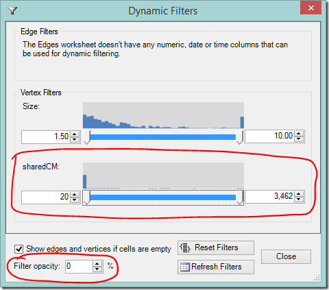
Dynamic Filters allow you to hide your most distant and/or closest relatives.

  • Select Dynamic Filters
    image
  • Scroll down or expand the window to find the sharedCM slider
    image
  • As you adjust the slider’s lower value, your most distant cousins will disappear.
  • Adjusting the slider’s upper value will hide your closest cousins (you may need to slide it down a long way).
  • If you want to still see the filtered information, but make it less prominent, adjust the filter opacity to your liking.image

Wakita-Tsurumi grouping with matches below 15CM filtered out

Excluding matches

If you have a very large number of matches you may decide not to work with distant cousins at all. In this case you could enter ‘Skip’ next to each one, or you could save some time when downloading by using the Filter: 4th Cousin option in the DNAGedcom client.

Deleting smaller matches from the match list, whether before or after importing to NodeXL, won’t help. Matches listed in the in-common-with file will still be included in the graph, you just won’t know who they are!

If you want to go a bit past fourth cousins, but not all the way to those speculative distant matches, filtering or skipping may be a better option than excluding entirely.

Excel tips:
1) If you copy a cell then select multiple cells and paste, the paste value (e.g. ‘Skip’) will be entered into all of the selected cells.
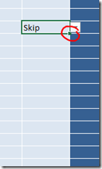
2) Double click on the square at the bottom right corner of a cell to copy it down the page automatically to the next filled box, or the end of the table whichever comes first. It can be a bit fiddly to get the right spot – the curser should change into a black plus sign + without any arrows.
image

DNAGedcom Note:
There are two versions of the DNAGedcom client being used at present. Version 2 is necessary if you have FTDNA matches, but it doesn’t have the filter option for Ancestry DNA matches (I’m told the option will be reinstated in future). The version linked to in the first post of this series does have the option.

Coming up

In the next post, we’re going to extract more information from the files we already have.

Wednesday, July 19, 2017

Visualising Ancestry DNA matches-Part 5-Busy graph diagnosis

Our computers have to crunch a lot of numbers to make up these graphs. Even more so for a busy one. If you haven’t cleared duplicate relationships since you last loaded data (or ever!) head back to Post 4 and do this step now.
In writing these posts I’ve tried to choose a path that will be both useful and accessible to as many people as possible. The options I’ve chosen and methods I’ve used may not be the ones that work best for you. The choices you make should be driven by the nature of your tree and your research goals.

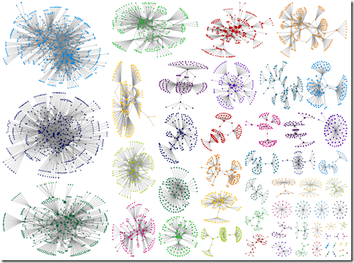
Before you try and clean up a busy graph, you need to understand why it’s busy. You’ll have a big head start on both understanding the relationships it shows, and what you would lose or gain by removing certain elements from the graph.

Sincere thanks to Blaine Bettinger, Joan Hanlon and Richard Rubin who allowed me to use their data to test the suggestions in this post. Thank you also to the several other people who offered me their data for the same purpose.

Why is the graph busy?

I have used one of Joan’s kits for demonstration purposes. The kit has 469 fourth cousin or closer matches. Below is the point reached, having followed the steps in earlier parts of this series.

image

The start point

Let’s take a closer look.

Distant relatives

Many of the groups have a cluster of interconnected closer relatives with a fringe of distant relatives. You can see the fringes quite clearly on the left of this group.

image

A group with a fringe of distant relatives.

Group interconnections

There’s a network of between-group streaks across the graph. In areas where these are thicker, it’s hard to tell where the streaks start and end. They obscure the relationships within groupings. We can work out where those linkages are coming from.

Interconnections from close cousins

As I click on each row of the Vertices worksheet, that person’s relationship lines are highlighted in red. I can see that some of the strong streaks between groups are due to a small number of closer relatives.

Connections from a third cousin are highlighted in the image below. This is gold! If Joan knows how that third cousin is related to the focus person, it will suggest what part of the tree those two groups are connected to. It works the other way around too. Clues from those two groups could lead to discovering how the predicted third cousin fits in.

image_thumb3

This third cousin has strong connections to two other groups

The number of lines from even a few first or second cousins, who will probably match with multiple people in other groups, may be enough to obscure what is going on in a graph.

Group interconnections – other linkages

If I move to the Groups worksheet, I can now click on each group in turn. All the people in the group and each of their relationships with other people, will be highlighted. The group below has linkages spread out to many other groups.

Remember that the relationship between two of your DNA matches may have nothing to do with your tree. It’s very likely that some of your DNA matches will be related to each other on other lines. While there are slightly more connections to the dark blue group, there’s nothing here that screams of a strong relationship between groups.   

image_thumb7[1]

On the other hand, the group at the top has multiple connections to the green group in the lower left hand corner (see below). It’s easy to imagine that the division of people between those two groups could change with a few new cousins added, or a slightly different grouping algorithm.

image

A prolific branch?

On the Groups worksheet I marked the Visibility column for all of the groups, except the two mentioned above, with the word ‘skip’. I Refreshed the graph and adjusted the Scale slider to see this:

image

It’s a bit hard to show it here – you’ll have to take my word for it – but it appears that there are perhaps half a dozen people at the furthest end of the the fourth cousin range with multiple connections to both groups. I found it interesting that the strong connection wasn’t driven by closer cousins. The group on the right also are more distantly related to the focus person, on average, than the group on the left. Perhaps a more distant, but prolific, line of descent from the same branch? Only research will tell.

Endogamy

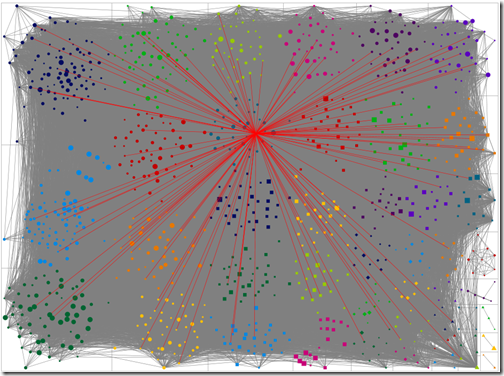
If you are from an endogamous population, and your computer survives the journey to making a graph, you will find yourself with dots on a solid mat of grey. The following graph is from a person known to have some endogamy. Only fourth cousins and closer have been included in the graph. Almost any vertex I click on connects to multiple groups – I’m not at all sure that the groupings are meaningful in this case. In the bottom right hand corner, a few clusters from the less endogamous portions of the tree peek out.

image

If you looked at graphs in earlier post, you’ll know this is far removed from my own. I take back any complaint I may have made about not having enough matches!

Cleaning the clutter

So we’ve rummaged around in the clutter and found some items that should go, and a few we’d like to keep.

What next?

The next post