Ready for the next step? If you need to catch up, refer to the index to find your way.
So far all of the dots on the graph represent individuals, and the lines represent (believed) DNA connections. What if we expanded our idea of what the dots on the graph could represent to include ancestral couples? Then we could draw lines (which still represent DNA linkages) between matches and their known ancestors.
Example

I noticed that one of the other matches in the same group descended from a David Isaac – the surname caught my eye. Through a combination of building trees up and down, and by contacting private and no-tree owners, I learned that at least five matches from this group descend from David Isaac and Maryann Coomb via various of their children. I decided to also add David Isaac and Maryann Coomb to my graph as it seems likely that I have some sort of DNA connection to them.
In a perfect world where everyone had complete public trees with consistent spelling, David Isaac and Maryann Coomb should appear on Ancestry as “New Ancestor Discoveries” (except that in a perfect world they would be “New Relative Discoveries”). It’s not a perfect world and I don’t expect that kind of hint to pop up on Ancestry any time soon.
Using the graph this way helps me to not only find that information but to keep track of and visualise what I’ve found.
Adding the information
Although you can add people and relationships directly to the graph file I prefer to compile the information in a separate file (the Additional Input file) and then import it. If something goes wrong it’s much easier to delete some lines, correct a small file and reload than to unscramble a file with ten of thousands of rows.
I’ve provided instructions for both methods. I find that compiling the Ancestry match IDs is the most difficult part of the process – I’ve also provided some instructions for a shortcut that may help in making the match ID list.
Method 1: Additional Input file method
Enter the following information in the Additional Input file:
- matchid : match’s AncestryID
- Match name : match’s name (for reference only, not loaded)
- Match admin : match’s admin (for reference only, not loaded)
- Vertex 2 : ancestor’s name eg ‘John Tregonning and Mary Isaac’
If you enter the same ancestor(s) for multiple matches, make sure the spelling, punctuation and spaces are exactly the same each time. - Name : as for Vertex 2
- Vertex Type : ‘Ancestor’
- Edge Type : ‘Ancestor’
- If you would like to be able to apply labels for only ancestors (not for everyone) add an extra column to the file called Ancestor Label and enter their names in that column as well.
There is some repetition here, but it will give us flexibility to do other things later.
When you import the file (NodeXL Basic ribbon, Import button, From Open Workbook…. option) choose the following options:
- Columns have headers box should be ticked.
- Under Is Edge Column select these (and no others)
- matchid
- Vertex2
- Edge type
- Under Is Vertex 2 Property Column select these (and no others)
- Name
- Vertex Type
- Visibility (not necessary if you don’t need to update the ‘Skip’ lines for anyone)
- Ancestor label
- Which edge column is Vertex 1? dropdown ‘matchid’
- Which edge column is Vertex 2? dropdown ‘Vertex 2’
Rerun the grouping and refresh the graph to see the new elements.
Method 2: Direct entry method
To add points to the graph manually you will need to add a row on the Edges worksheet for each DNA connection you want to make. That row needs two identifiers: one for the match and one for the ancestor(s).
- Move to the bottom of the Edges worksheet (see tip below)
- Enter the Ancestry ID for your DNA match in a new row under the Vertex 1 column.
- The second identifier (Vertex 2 column) should be an identifier for the known ancestor(s). Since they don’t already have an identifier just use their names – eg ‘John Tregonning and Mary Isaac’.
It doesn’t matter which identifier is Vertex 1 and which is Vertex 2, this just happens to be the convention I’ve settled on. That’s enough to create the relationship. When you refresh the graph a new row will automatically be created on the Vertices worksheet.
A little extra information will help us find those lines again if we need to and will give us more flexibility later.
- On the Edges worksheet:
- On the Vertices worksheet,
- If you haven’t refreshed the graph yet create a line for each Ancestral pair, then
- Add the ancestor identifier (ie their names) to the Vertex column AND the Name column.
- Add a column called Vertex Type and set the value to ‘Ancestor’ for the appropriate rows.
- If you would like to be able to apply labels for only ancestors (not for everyone) then add another column called Ancestor Label to the Vertices worksheet and enter the ancestor identifier (ie their names) there as well.
When you’re trying to link data, spelling and punctuation matter! Make sure that you enter the ancestor names 100% consistently across your matches and the two sheets.
Rerun the grouping and refresh the graph to see the new elements.
Excel tips:
To add a column, just type a label that will become the column header in the first empty cell in row 2.
To quickly move all the way to the bottom of a full column: Select any cell in the column. On your keyboard tap the End button and then the down arrow.
Shortcut for assembling Ancestry match IDs
I find that the hardest part is assembling all those Ancestry match IDs. You may be able to speed up the process by extracting the list of match IDs from your match list.
- If using the Additional Input file (or refer to Part 2 to create one), open it up so that it is ready and waiting.
- Open the matches file “m_YourName.csv”
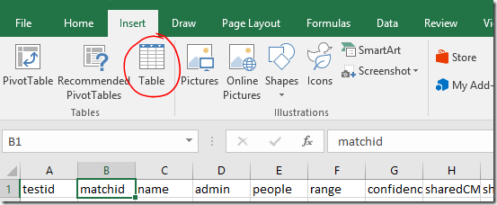
- Select any cell within the table area. On the Insert ribbon, click Table.
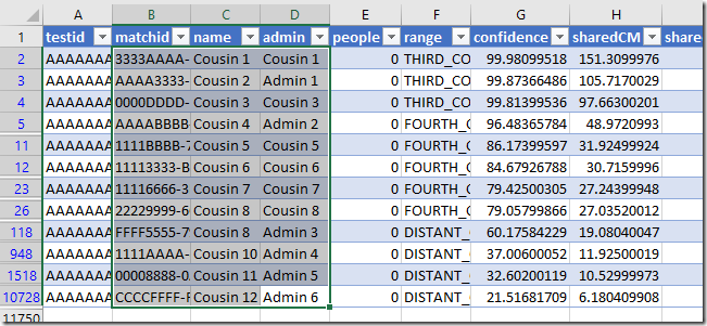
- The appropriate range will be automatically selected. Make sure My table has headers is checked, and click OK.
- The appearance of the table will change and drop down filters will appear on each column header.
- Use the drop down on the Hint column to filter for matches with a shared ancestor hint.
- Click and drag (or click and Shift-Click) to highlight all the visible rows for the matchid, name and admin columns.
- Copy
- Switch back to the Additional input file and Paste these into the first available empty cell under matchid.
Fill in the other columns as above.
Additional tip: You could filter the list to see details for people with notes, or who have the value TRUE in the ‘starred’ column, depending on how you’ve been using these.
Formatting and labelling
We added a column called Ancestor Label which contained duplicated name information. The purpose of this was to allow you to leave name labels off for your matches, but show them for ancestors if you wish. To apply the name labels use the Autofill Columns button.
Labelling tip: If you want to remove existing labels, click the arrow next to the drop down and you will find an option to clear the label column (you won’t see the change until you refresh the graph).
I’ve applied different formatting to the Ancestor markers and lines so that it will be clear to me what they are. We’ll go into other methods in a future post – but for now you can alter them using the same method as described in the previous post.
- Select any rows on the Vertices worksheet that contain ancestors (it may be helpful to sort the Vertex Type column if they are not all together).
- Right click a highlighted line on the chart to access the right click menu.
- Click Edit Selected Edge Properties… for line formatting options.
- Select the rows again if you need to.
- Right click a highlighted dot to access the right click menu again and click Edit Selected Vertex Properties… for marker formatting options
OR
Make the changes using buttons on the NodeXL ribbon.
I set the edge Style to ‘dot’, and the vertex Shape to ‘label’ in the example at the start of this post.
Applying the marker changes
If you’ve been following along, you’ll find that the Edge colour changes work, but Vertex colour and shape changes don’t. There’s a setting that will fix that.
To use your selected Vertex colours and shapes:
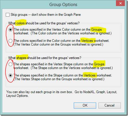
- Select the Groups dropdown on the NodeXL Basic ribbon.
- You’ll see an options box that directs NodeXL Basic whether to use colours and shapes from the Groups sheet, or to take them from the Vertices worksheet. If you use colours from the Vertices worksheet you’ll lose the rainbow of group colours but gain the ability to choose your own colours point by point. Shapes work similarly.
- I elected to keep the bright group colours for now.
- I wanted to change the shape of the marker so I changed the option under What shapes should be used for the groups’ vertices? and clicked OK.
More ideas, and next steps
If you’re feeling adventurous, you might like to try adding points for non-person information such as a particular place, an unusual surname, or even an ethnicity. I’ve played with doing this. It worked quite well if the value being linked was uncommon (‘Smith’ was a disaster!!) but ultimately I decided that colour coding these values (coming soon!) worked better for me.
The next posts are the ones that I’m really excited about showing you! They’re what I’ve been building to all this time. First we’re going to think about combining the kits we manage. Then we’ll move on to colour coding – I’ll show you how to set up colour coding schemes and switch between them at will.


This is a wonderful series! I now spend way too much time playing with this! This process has allowed me to see who among my matches is related to whom, and I am gradually figuring out which ancestral lines are represented in each group. I eagerly await every post!
ReplyDeleteThanks I am at the point point of entering in known ancestors...Would it be useful to enter my deceased ancestors separately (not coupled) with their known matches (say a 4th cousin who took an Ancestry DNA test and we know through paper trail how we are connected) and add cMs to them based on the average cM of that relationship or is that a waste of time? For example putting in a great grandparent relationship as 850cM not sure really how that would really help but it feels like it should... or is the couple relationship more useful.
ReplyDeleteUnless your cousin is a half cousin, or you know which of the pair passed on the DNA you share with your cousin, I would enter the ancestors as a couple. Adding the estimated shared cM could be very useful. Why didn't I think of that?! :-) At minimum, you could use it to resize the markers for your ancestors to make them more prominent.
DeleteTried this out today to see if it added useful information to the chart for researching my Corey lines. I was already using tooltips and vertex color at times to identify people's specific confirmed ancestry. So I wasn't sure that adding ancestor vertices would pull out something new vs just adding clutter to the graph.
ReplyDeleteI'm pleased to report there's a desirable side effect for me of adding selected known ancestors and linking small numbers of people to them. Say I have five people from one branch of cousins. They tend to end up in the middle of the graph along with other "important" cousins. The people will be intermixed in the center, so even though you know some of them stem from one family, the grouping algorithms don't know that for sure. By adding one ancestor and five links (one per known descendant), you are nudging the grouping algorithms to maybe pull those five vertexes closer together and away from other vertexes who don't share that ancestor. The effect is kind of subtle, but it seems to help straighten up the diagram when two or three lines of closer cousins all cluster together in the center in a seemingly random way. The addition of known ancestors nodes tends to pull the clumps of descendants towards each other, reducing the randomness.
I also set the nodes to be solid diamonds of above average size to highlight the ancestral "clusters". At the end, I tried enabling the "snap to grid" option to keep bigger diamonds from covering up smaller circles. While the non-snapped graphs look prettier, the use of the grid does keep the nodes out of each other's way more and can make the graph easier to understand. / Tom
Hi Tom, it's good to know it had a positive side effect. If you like what it does to the layout, but not the extra lines, you might experiment with marking the ancestor node as "Hide". This way it's still used in the layout calculations but not shown in the chart.
Delete