This is the tenth part of a series of posts about visualising Ancestry DNA matches with network graphs. You can find the index to the posts here. In this post, I’ll show you how to colour code your matches.
The material in this post is what I have been most looking forward to showing you. There is so much you can do with colour coding! I’ll provide a few ideas and examples, but would love to see what else you come up with. Tell me about it in the comments, or join the freshly minted Network Graphs for Genetic Genealogy Facebook group here.
What information can I colour code on?
You can colour code on whatever you want! If you can get it into a column you can colour code on it. For a start, here are some ideas with no data manipulation required (although you may need to load extra columns from your matches file):
- Starred matches. Where do those people you were interested in fit?
- Viewed matches. Immediately spot critical new matches.
- Shared ancestor hints. Have you checked them all out?
- Numerical information – eg SharedCM, Shared Segments – can be used to create a heat map to help spot clusters of closer or more distant matches.
- Manually add a column with the branch that a known matches belong to, and colour code on that. This can help to identify clusters from a particular part of your tree. I recommend only colouring matches that you know for sure belong to a particular branch.
If you’re able to use Excel or a database tool to manipulate the data yourself, even more options are available. For instance I have found it very useful to download the ‘ancestors’ file (using the DNAGedcom client) which contains a lists of ancestors for your matches who have their DNA connected to a public tree:
- Matches with a particular surname or surnames in their tree.
- Matches with a particular place or places in their tree.
These examples don’t work so well with names like “Smith” – but are fantastic for finding clusters with less common names or from a particular region.
Get the settings right
Colour by vertex
The default setting, once groups have been created, is to colour by group.
In order to apply colours by person, we’ll need to tell NodeXL to 'colour by vertex’ instead.
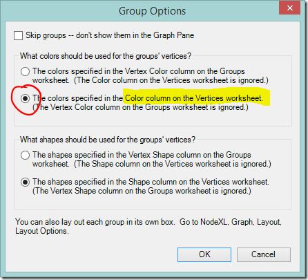
- NodeXL Basic ribbon > Groups > Group Options…
- Select “The colors specified in the Color column on the Vertices worksheet”
At this point all the dots will change to the default Vertex colour (black). If you want to return to group by group colours you can change back at any time by selecting “The colors specified in the Vertex Color column on the Groups worksheet”.
Prevent the nodes from moving
Each time when you change the colours you will need to refresh the graph to apply the change. The chart layout will be applied again, and the nodes will move.
If you like the nodes where they and don’t want them moving about you can keep them in place:
- Set the layout algorithm to “None”
OR
- Highlight the nodes of interest and click the Lock button to lock them in place.
(highlight them and click the Key button to allow them to move again when you refresh the layout, if desired).
Applying colour a few nodes at a time
Manual methods are useful if you only want to apply colour to a few nodes and don’t want or need to switch between different colour schemes.
The easiest method is to select a node or nodes from the chart using the Select tool.
- Select the nodes of interest.
- Choose a colour using the colour picker on the NodeXL Basic ribbon.
- Click the Refresh Graph button to apply the changes.
OR
Enter a colour directly into the ‘Color’ column on the Vertices worksheet. If the column is not already visible you can show it both the Edges and Vertices worksheets via the NodeXL Basic Ribbon > Workbook Columns button.
In the Color column:
- Right click and selecting a colour using the “Select Color” menu option, or
- Type in an RGB colour reference in the format R, G, B. For example, 0, 255, 255, or
- Type in a CSS colour name. For example, DarkSeaGreen.
Click the Refresh Graph button to apply the changes.
Apply colour in bulk – the real fun begins!
Applying colour (or other formatting choices) in bulk is very easy. If it’s in a column, you can colour code with it. It doesn’t matter how that information was entered in the column – loaded in, typed, derived by a formula – or what type of data it is. Pick one of the ideas I listed at the start of the post, and try it out.
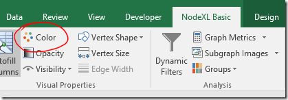
- Apply colour via the Autofill Columns button on the NodeXL Basic ribbon.
- If you have previously applied colour (whether manually or by using this control) choose the option to “Clear Vertex Color Column Now” to start fresh.
- Select the column to code on from the Vertex Colour dropdown box.
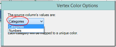
- Check the settings under “Vertex Color Options….”.
If you are colour coding on text values choose “Categories” from the dropdown box at the top left and click OK. - If you want to colour code using a numerical scale, choose “Numbers” and more options will appear.
View the legend
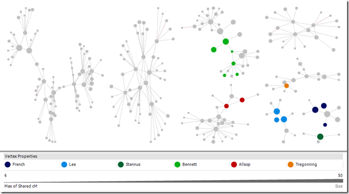
Once of the useful features of automatic colour coding is that NodeXL will generate a legend for you.
Change default node colour
Unfortunately NodeXL doesn’t allow you to choose the colours applied to each category. The first colour used is always a dark blue, which on my monitor is hard to distinguish from the default colour of black. It’s possible to change the default colour using the graph options.
- Click the Graph Options button
- Select a new colour by double clicking the colour swatch on the Vertices tab.
I encourage you to explore the other changes to default settings that are possible.
Example – Categories
Applying colour codes to categories really is as simple as selecting the column in a drop down box. This is a quick example of the type of investigation possible. Don’t forget – before you add new colours always use the option to clear the colour column or you might mix up your schemes.
Colour code matches with known branches
I manually added a column to the Vertices sheet labelled “Branch” and entered a surname indicating the branch for each person where the common ancestor is known. Then I clicked Autofill Columns and set my new Branch column as the vertex colour. My DNA results have a lot of very small groups. I can now easily see which branch six of them are connected to. It’s a start!
Colour code by side
I loaded both my own and my father’s matches into one file and then used a formula to mark each match as “Paternal” or “Maternal” in a new column depending on whether they shared DNA with my father. When I colour coded on the new “Side” column I could see that there was a clear division between groups, with a few strays. (Selected larger groups are shown for the sake of illustration).
This works with my tree as my branches are not inter-related and are generally from distinct populations. With a more interrelated tree it may highlight groups where it would be dangerous to make an assumption about side.
DNA matches colour coded by side (maternal, paternal)
Colour code a place
Now I want to see if I can dig in further.
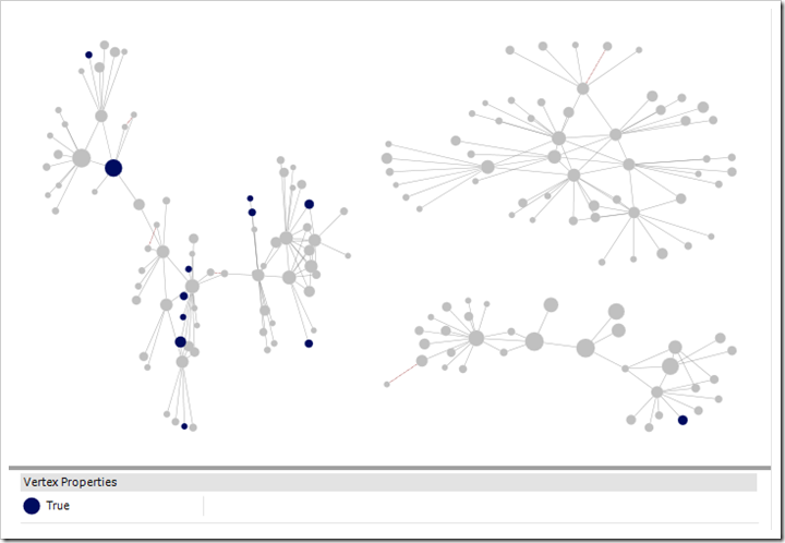
Once quarter of my father’s tree is from Cornwall. Many people have Cornish ancestry and following up on every possible Cornish lead could take me on any number of wild goose chases. Instead, using the ancestors file downloaded using the DNA Gedcom Client, I created a list of matches whose ancestors were born or died in Cornwall.
While there was an occasional individuals highlighted here and there among my groups, one group stood out. This was a group where I had not confirmed any of the relationships – the only clue I had to go on is that they are matches to my father.
I would not expect every dot in a group to be coloured as not all matches have public trees on Ancestry. If you have made a list with places or names using the ancestors file, try also searching your matches on Ancestry itself. Chances are there will be some private trees among the results. You can add their matchIDs to the import list and make use of that information. Yes, you read right. This is a way to squeeze some information from private trees!
Note also that only one of my closer matches is marked blue indicating Cornish ancestry in a public tree. It was the trees of distant matches, which I may never have looked at otherwise, that made the difference.
DNA matches who have any ancestor born in Cornwall highlighted
Kit with 125 4th or closer cousins (more distant cousins included in chart), cluster by connected component, Harel-Koren Fast Multiscale Layout with each group in it’s own box. Selected groups.
Example – Numeric information
In earlier posts we used the SharedCM column to size the dots, so that closer relatives would have bigger dots. The human brain, however, is more able to pick out colour differences than size differences, so if you are focusing on groups around your closer matches, a heatmap type display might be useful.
We can use colour to make those close cousins stand out more – the eye tends to be drawn to warm colours. In this example, closer relatives are more orange and more distant matches will be a deep purple/blue.
- Click the Autofill Column buttons.
- Set the Vertex colour to sharedCM.
- Click the options button and choose Vertex Color Options…
- Select Numbers in the dropdown.
- Click Swap Colors so that closer matches will be more orange.
- As I wanted all distant cousins to be blue I set the smallest number to 20cM.
- I wanted all estimated 2nd cousins to be strongly orange, so I set the other extreme to 200cM.
I used a kit with more interconnections that my own. The result is below. In this kit there are two groupings of closer cousins. The cousins in the centre of the graph have more connections, while relatives of the group on the left seem to be less well represented in the DNA testing population.
DNA match heatmap – closer cousins are more orange
Kit with 470 4th or closer cousins, cousins with <15cM shared excluded, Harel-Koren Fast Multiscale Layout to set start positions, followed by two applications of the Fruchterman-Rheingold layout with repulsive force 1.0 and 3 iterations to increase the visual definition of the groups. Smaller unconnected components displayed separately at the bottom of the screen.
Where to from here?
This is the last post I have planned in this series focusing on Ancestry and NodeXL, but I doubt it will be my last post on the subject of network graphs. I’ve created a group on Facebook for discussion of Network Graphs for Genetic Genealogy. If you would like to have a conversation about what you’re doing with network graphs as they apply to genetic genealogy (regardless of the source of DNA matches or software used!) please comment below or better yet join the Facebook group.










Thanks again for such a great explanation! I've been looking forward to #10...the visuals are really helping though I haven't quite got the newest post completely figured out I guess it is always a work in progress. A follow up question to my question regarding the usefulness of entering shared cMs for deceased ancestors. Your current way of changing the dot (vertex) sizes to reflect the closeness of shared cMs is quite helpful visually but I am wondering in addition if you know if there is a way to manually enter estimated cMs on the edges worksheet (or somewhere else) for cousins who I've learned how we are related and have entered the deceased ancestor connections between us. Is there a way to have the appearance (say the length of the connecting line) reflect the distance of the shared cM relationship of two people when it is known...I have been manually dragging people around to change the length of the lines but an automatic filter to visualize distance of known connections seems quite useful does that mean a cM column in the edges worksheet? (I don't see any 'edge' settings in "dynamic filters" but I don't know much about Excel. Maybe I can manually change the appearance of each edge tediously one-by-one but I am hoping for an automatic way to enter that info into spread sheet. I hope that makes sense. For example say I have a few 4th cousins all of the same generation I have connected them all to our common ancestor (3x great grandparents) as well as entering the direct deceased descendants in between that connect us all...can I some how change the edge length between the connections to visually have them appear closer sort of a self organizing combination of known and unknown connections. I am hoping to use my known connections to help pull the unknown connections closer visually to the side of the tree they belong using average cMs for known relationships deceased and living. Anyway maybe it is not possible or maybe not useful for the effort but I do enjoy seeing all the data take shape. Thanks again!!
ReplyDeleteYou're welcome! It's nice to know that someone has made it all the way to the end!
DeleteYou can add a column to the edges sheet with the information you want either directly in the worksheet or by importing it - two vertices and the new column would all need to be marked as "Edge" columns.
With that information loaded, edge filters should then appear in the dynamic filters. I don't believe the algorithms in NodeXL make use of the edge weight for layout, but you can make particular edges stand out by using the "autofill columns" button to make adjustments to the edges just as you can with the nodes. A combination of opacity (how transparent lines are) and colour should make them stand out. Edge weight makes the lines wider and might be useful, but I find that anything above 2 is just too much.
Also try out different layout algorithms. For my matches, which are sparse, Harel-Koren fast multiscale works well. For busier charts I've found Fruchtermann-Rheingold better with a bit of playing - there are two setting you can adjust in the options that will modify how that one works, the repulsive force and the iterations. It takes the current layout as a starting point so if everything is getting pushed to the edges with it (you'll see what I mean if you try it) go to a random layout and start again. OR what I did in this post was run a Harel-Koren layout as a start point, then Fruchtermann-Rheingold with low repulsive force and low iterations, just to tweak it a little.
Good luck!
Thanks I will keep messing around with that in mind I didn't realize the current layout with adjustments I made would act as a starting point rather than just regenerate a randomly new chart...those are the little tips I wouldn't have figured out in a million years, that really helps thanks. And I hope this isn't the last we see of your charts, thanks again for taking the time to be thorough in your explanations! It looks like 23andMe started showing the cMs for how your matches are related to each other unlike ancestry where they just say "shared match" Hopefully Ancestry takes note and also includes the relation between shared matches
Delete